Harsh landsby
NatashaComment by Azrifel: ~~~~Critique Club Comment~~~~
Composition (content)
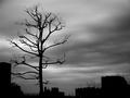
Good silhouette. The dreary sky, the tree without leafs and the choice for B&W do a good job in communicating the message. In a way the tree and sky seem to tell the story about live in this place?
The placement of the tree and buildings is excellent and it is great how the bright parts of te sky are behind the tree and enhance the contrast.
The building at the lower left is a distraction. The picture would be better without it being there. You could opt to take it out for purposes other than this site (where the rules don't allow spot editing). This could also be applied to the branches in the lower right part of the image.
The tones in the sky are great.
Background
No real background, see above.
Camera Work (Technical)
The exposure is excellent for a silhouette. No detail in the foreground subjects, dramatic/erie dark grey tones in the sky. I don't know how much of this was done with the camera and how much in post processing, either way it is a good job.
Focus is good, depth ok, sharpness ok.
Digital Processing (technical)
Concerning quality vs compression I again have to say: save at the highest quality possible. See the comment on "Motion" picture.
A little bit of unsharp mask (30% 0,4 1) doesn't hurt, but isn't really necessary.
My opinion
Nice, but it does not really appeal to me personally.
Message edited by author 2002-12-23 11:36:58.