| Image |
Comment |
| 01/28/2003 11:41:38 PM |
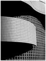
Wall of Windowsby NatashaComment by Alecia: this is gorgeous--very eye-catching. i cant say enough how well the angles and lines and curves work together here---you have a wonderful eye for graphics. im glad you chose B&W for this as well---wouldnt be the same in color! wonderful work! :) |
 Photographer found comment helpful. Photographer found comment helpful. |
| 01/28/2003 10:22:43 PM |
|
| Photographer found comment helpful. |
| 01/28/2003 04:07:55 PM |
Simply Blueby NatashaComment by Roseytone: The more I keep coming across this picture the more I like it. It has a fantastic mystical quality with the mountain taking a while to come into focus. FANTASTIC !!!!! |
| Photographer found comment helpful. |
| 01/28/2003 01:05:25 PM |
Wall of Windowsby NatashaComment by Patella: Great contrast and love the sinuous lines of the shot. It makes an excellent abstract. There are nits, and I don't know that you can do anything about them, but I'll point them out anyway. All of these beautiful clean lines are broken up by that wire (?) in the upper right corner -- go cut it down. ;-) There are also some strange shadows -- perhaps cast by the same wire, or by cousins orwho knows in the window section -- these are much less distracting than that wire. There are some ways, not too hard to use, to get rid of all of those problems if you'd like some help. |
| Photographer found comment helpful. |
| 01/28/2003 11:22:57 AM |
|
| Photographer found comment helpful. |
| 01/28/2003 11:03:11 AM |
|
| Photographer found comment helpful. |
| 01/27/2003 09:16:18 PM |
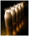
Gold Blend by NatashaComment by timj351: Congratulations Natasha. This is very well done. The composition, lighting, texture, forms, and execution are all handled beautifully. It is definitely deserving of first place.
T |
| Photographer found comment helpful. |
| 01/27/2003 09:09:34 PM |
|
| Photographer found comment helpful. |
| 01/27/2003 07:28:58 PM |
Gold Blendby NatashaComment by magnetic9999: CRITIQUE CLUB REVIEW
Excellent picture with a great mood and a very professional feel to it. Part of that comes from the quality of the surface it's on, and the other part comes from the very soft differential lighting on the milk bottles.
A few possibilities you could try:
a) a lower angle looking more less down on the bottles
b) more empty space at the top of the screen
c) a little less empty space at the bottom
d) another angle from the more the front of the line and lower.
great shot i think it could be in advert! |
| Photographer found comment helpful. |
| 01/27/2003 05:06:17 PM |
|
| Photographer found comment helpful. |
Home -
Challenges -
Community -
League -
Photos -
Cameras -
Lenses -
Learn -
Help -
Terms of Use -
Privacy -
Top ^
DPChallenge, and website content and design, Copyright © 2001-2026 Challenging Technologies, LLC.
All digital photo copyrights belong to the photographers and may not be used without permission.
Current Server Time: 07/16/2026 07:39:52 PM EDT.