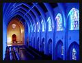
The Sanctuary
by
RackatComment by karmat: CRITIQUE CLUB CRITIQUE
by karmat
(One of my favorites this week!)
COMPOSITION
The composition of this really works to attract the viewer's eyes and draw them towards the altar. I think it is particulary effective that you can see almost all of the far wall, and very little of hte near one. The nice arch shape, that repeats with each of the trusses also adds to the drawing power of this shot. I know part of it is an "illusion" but it feels just tilted a bit to the left. Not enough to detract a lot, unless you sit and stare at it for awhile (which is what I have done to decide what to write), but once you notice it, it really is kinda weird.
TECHNIQUE
Simply awesome colors. Not just the blue, but also the different colors of the windows. Then, the front part really adds a nice contrast, and gives some warmth to the shot. There are a couple of spots that are almost blown out (up at the altar, and some spots in the window) BUT I don't think it necessarily detracts from the overall effect of the picture. He/She is not really noticeable, but if you could have shot this without the person, it would have given it an even more powerful/untouchable feeling to it.
OVERALL EFFECT
The blues to me make this shot feel really cool and isolated. Then the altar colors warm it up a bit, and become a focal point. Together, the colors and angle give this a very "holy" feel to it. Perhaps that is why the person kinda feels out of place to me. It looks almost untouchable, even. Of course, if you were wanting to depict that "sanctuaries" were touchable, the person is very necessary. Any way. A wonderful picture, and an awesome job!!! congrats on another ribbon!