| Image |
Comment |
| 09/11/2005 12:11:47 AM |
Deep Longing (to join a game with the big boys!)by trobergeComment by HBunch: *Critique Club*
I'd have to agree that the neatimage (or similar effect) looks a bit overdone. By looking at the photo itself, I would not be able to guess the D and L. This is a shot that I feel relys on the title to help it through the challenge. I like the look on the skin, but I think it makes the hair look odd that way. Nice crisp focus on the shirt. I like the texture there. The background is ok, nothing distracting there, although maybe a tad bright near the top. I like where you have placed the boy within the photo. This creates some good negative space, and the fact that there is neg. space in front of him does add appeal. Good job avoiding shadows/bright spots on his face. Overall definately a great shot for the photo album. I would try lightening up on the neatimage just a bit, and maybe editing the hair seperate, so that it doesn't seem so much different than his face. If that makes sense.
~Heather~ |
 Photographer found comment helpful. Photographer found comment helpful. |
| 09/10/2005 08:40:58 AM |
|
| Photographer found comment helpful. |
| 09/09/2005 11:36:27 PM |
|
| Photographer found comment helpful. |
| 09/07/2005 09:48:31 PM |
m&ab&w.jpgby trobergeComment by smilebig4me1x: looks to be a lesson in noticing your surroundings and a very nice capture. love the light and great choice of B&W as i dont think this would have the same impact in color. great comp but focus seems to bave been a bit off and oversharpened used. may just e my monitor and the small photo tho. still a wonderful image and a keepsake for years to come. :o) |
| Photographer found comment helpful. |
| 09/07/2005 05:49:47 AM |
|
| Photographer found comment helpful. |
| 09/06/2005 11:30:34 PM |
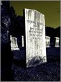
cem3b.jpgby trobergeComment by SJCarter: Great contrast in this shot. Good focus and very nice composition. I have to agree about the sky color though - I think you could get away with it if there were some other elements in the shot that contained that particular tone; in fact it would be really cool if you could have that tone elsewhere - somewhere where the eye should be drawn. Intriguing shot nonetheless. |
| Photographer found comment helpful. |
| 09/06/2005 12:29:17 PM |
cem3b.jpgby trobergeComment by Schuff: Interesting shot. I am not sure I like the color of the sky here as it seems either not natural or out of place and pulls the eye up. But the contrast on the tombstone works great and adds to the feeling of the scene. |
| Photographer found comment helpful. |
| 09/05/2005 10:58:11 PM |
|
| Photographer found comment helpful. |
| 09/05/2005 08:22:20 PM |
Contrasting Colorsby trobergeComment by Tammer: The flower colors really do pop out at me. The green tones lessen that contrast a bit as does the border you chose, but nice composition. |
| Photographer found comment helpful. |
| 09/05/2005 11:56:26 AM |
Contrasting Colorsby trobergeComment by downtherabbithole: the quality is very lowon this image, very grainy I like the take on the color contrast side of things but the green in the frame takes it farther away from contrast and farther towards a color triangle, which is balance not contrast |
| Photographer found comment helpful. |
Home -
Challenges -
Community -
League -
Photos -
Cameras -
Lenses -
Learn -
Help -
Terms of Use -
Privacy -
Top ^
DPChallenge, and website content and design, Copyright © 2001-2026 Challenging Technologies, LLC.
All digital photo copyrights belong to the photographers and may not be used without permission.
Current Server Time: 07/16/2026 11:29:50 PM EDT.