Sail awayby
stupotComment by HBunch: *Critique Club*
Well, if you didn't find the 9 great comments you have already received as helpful, then I'm not sure I'll be able to add anything useful myself, since I tend to agree with all commenters thus far.
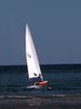
The first thing that jumps out to me is the tilted horizon. You have a very strong horizontal line in the background and not only does it cut straight through your main subject, but it's also tilted. What this does, is it makes the photo look like it was not only quickly composed, but also that not a lot of time was spend post processing, which is important, especially on a photo like this.
This photo suffers greatly from noise too. See the grain in the sky? This could be improved by running it through a program intended to reduce noise. Neatimage is one such program and can be downloaded //www.neatimage.com/ there. There is also a program called noiseninja, however I have had no experience with that.
While there is contrast in the photo, I'm not sure I would consider it as HIGH contrast. There really isn't any dark darks in the photo, except for the guys shorts, and that's such a small portion of the photo, that i'm afraid that it doesn't make for high contrast of the bright sail.
Focus seems a bit soft, but this could be due to the high noise in the photo. We don't really get much detail out of the man on the boat or the man in the water, and I find him a bit of a distraction.
A bit of brightness/contrast and some hue/saturation adjustments could help out the colors a bit. Definately wouldn't hurt to try.
~Heather~