| Image |
Comment |
| 08/02/2006 10:59:31 AM |
|
 Photographer found comment helpful. Photographer found comment helpful. |
| 03/19/2006 01:42:41 PM |
|
| 03/19/2006 04:39:44 AM |
|
| 03/16/2006 08:34:09 PM |
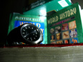
Sunday Nightby MakrossComment by Shan2112: nice DOF, lighting glare in the center is a bit distracting, meets the challenge though - good job :) |
| 03/16/2006 02:12:34 PM |
Sunday Nightby MakrossComment by taterbug: hehehe, nice idea. The late night cram session :-) I like the dof you've used. The context of the shot is definitely there, but attention is drawn nicely to the watch, to get the concept of the image across. Might be a stronger presentation if the framing were cropped close to the bottom of the watch. It is hard to tell if that is a book or what the watch is sitting on, and feels like it doesn't really add to the shot. Good lighting too, it does have the feel of late at night. Good job. |
| 03/16/2006 11:29:17 AM |
Sunday Nightby MakrossComment by lemondster: nice shot easy to relate to and fits the challenge with ease picture is good but isnt overly unique or well shot. i think it is a little dark and i would have liked to see the foreground book (red) in focus 6 |
| 03/16/2006 11:25:25 AM |
|
| 03/15/2006 01:24:49 PM |
Sunday Nightby MakrossComment by Claya: Exposure seems uneven to me and focus is on the time rather than the books (the education part), which doesn't really work for me. |
| 01/16/2006 07:53:57 AM |
|
| 01/15/2006 08:00:57 AM |
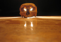
" You shall not pass! "by MakrossComment by ddng: Maybe a bit too much of the floor here. I think a greater majority of the black background would have made the skull stand out more. Also the fact that it is not quite centred is distracting. |
Home -
Challenges -
Community -
League -
Photos -
Cameras -
Lenses -
Learn -
Help -
Terms of Use -
Privacy -
Top ^
DPChallenge, and website content and design, Copyright © 2001-2026 Challenging Technologies, LLC.
All digital photo copyrights belong to the photographers and may not be used without permission.
Current Server Time: 07/07/2026 08:00:28 AM EDT.