| Image |
Comment |
| 08/03/2005 01:25:46 AM |
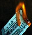
Money To Burnby rlpenman1Comment by DrAchoo: So why is the serial number upside down compared to the denomination? Something just looks a bit wrong... |
| 08/03/2005 12:38:20 AM |
|
| 08/03/2005 12:17:37 AM |
|
| 08/02/2005 11:46:36 PM |
|
| 07/31/2005 10:07:13 PM |
|
| 07/30/2005 08:35:31 PM |
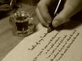
The Poetby rlpenman1Comment by DebN2003: Good interpretation of the theme. Good framing. Needs more texture on the hand. and pen. |
| 07/29/2005 04:59:13 PM |
The Poetby rlpenman1Comment by CLarson557: Very nice composition. Well put together and such a good idea. I love the poem from what I can read of it. Very creative and I like that. Good job. 10 |
 Photographer found comment helpful. Photographer found comment helpful. |
| 07/28/2005 07:55:01 PM |
|
| 07/28/2005 10:17:59 AM |
|
| 07/27/2005 11:30:51 PM |
The Poetby rlpenman1Comment by savannahjames: Love the idea, and the composition. My one criticism is the choice of font - it's very easily recognized, and makes it obvious that the page was printed and not actually written by hand. There are tons of free handwriting fonts available for download that wouldn't be so easily recognized. I love the creativity, though! |
| Photographer found comment helpful. |
Home -
Challenges -
Community -
League -
Photos -
Cameras -
Lenses -
Learn -
Help -
Terms of Use -
Privacy -
Top ^
DPChallenge, and website content and design, Copyright © 2001-2026 Challenging Technologies, LLC.
All digital photo copyrights belong to the photographers and may not be used without permission.
Current Server Time: 07/16/2026 10:18:05 AM EDT.