Not from this planetby
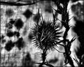
AbraComment by NiallOTuama: Black and white processing, in my opinion (and it's not an educated one, it is just one that I have formed based on how I react to images), has the potential to bring a very moody feeling, more so than colour processing I think, and this is what you have achieved in this.
I love the background textures. It's excellent that you got the out-of-focus blobs on centre-left, but then with some hatched texture of the fabric too. And I like how when swept from left to right this detail becomes less and less pronounced. Perfect for drawing the eye to the main subject while having an interesting background.
As for the main subject (a thorn bush of some kind?) it is an interesting subject. I think it was probably your intention and I think it works for moodiness (but probably not for scoring) but it is basically only black and white with no greys. This makes it stand out from the background quite well, but what it does not do is show you details on the bud (is that what it is?). It looks like a spikey black ball with white streaks in it. Again, I personally think this works but I think the more common DPC voter appreciates detail and mid-tones more than cut-out blacks and moodiness.
I do like the stalk thing more to the right of the thing I call the bud. That is nice and textured, but what I really like about it is that it's only when you look at it that you discover the textures. Almost like a reward for your time :-)
I gave this a 7. Reasons for not more are that I am not that an uncommon DPC voter and really like details, the blob to the very right distracts me, and because I really wish there were more details.