DPChallenge: A Digital Photography Contest You are not logged in. (log in or register
 
Browse Settings
Currently viewing:
Registered Userdavidus428

Show comments:

Per page:

Order:

Comments:


Comments Received by davidus428
Pages:   ... [157] [158] [159] [160] [161] [162] [163] ... [197]
Showing 1591 - 1600 of ~1967
Image Comment
Coke Drops
11/06/2005 12:22:15 AM
Coke Drops
by davidus428

Comment by georodea:
awesome
Close Encounter
11/05/2005 11:06:08 PM
Close Encounter
by davidus428

Comment by DevilsAdvocate:
That rules
Coke Drops
11/05/2005 02:58:57 PM
Coke Drops
by davidus428

Comment by json:
Whoa sharp, I like it, top 5 I think.
Close Encounter
11/05/2005 02:35:09 PM
Close Encounter
by davidus428

Comment by fplouffe:
Wonderfull shot.
Close Encounter
11/05/2005 09:49:06 AM
Close Encounter
by davidus428

Comment by cmeier:
i love the colour in this shot. well done.
Coke Drops
11/05/2005 01:47:08 AM
Coke Drops
by davidus428

Comment by fotomann_forever:
Making me thirsty, must be good...
Coke Drops
11/04/2005 03:50:26 AM
Coke Drops
by davidus428

Comment by BigK:
Very nice shot!
Coke Drops
11/03/2005 09:17:22 PM
Coke Drops
by davidus428

Comment by dlprit:
That's really neat
Pot Pourri
11/03/2005 10:37:19 AM
Pot Pourri
by davidus428

Comment by RKT:
Hi there David and greetings from the "Critique Club"...

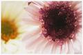
Ahhh...one of the images I commented one during the "grain" challenge. I still stand by what I mentioned in my previous comment...the grain completely enhances this image for me. Like bpickard, I am not a massive fan of the "flower" picture, to get my attention they must somehow be different, and for me "PotPourri" is just that. The color is delightful and the focus you chose is very effective. I enjoy the pink contrasted against the yellow, I find it very satisfying...delicious.

How might this image have scored higher? That I'm not sure about...perhaps the subject matter? Again...not sure. A few possible "nitpicks"...the longer I gaze at this the more I'd like to see a bit more detail in the center of that gorgeous pink flower, I know that there is some lovely texture there I am just not seeing. And perhaps a different crop? I also keep wanting to see a tad bit more room at the top of the image, that maybe the top of the pink flower is a bit clipped. I am hard pressed to find any other possible "flaws".

Overall this a very pleasing image, very soft and ethereal, actually something one might find on a greeting card, note paper, etc. I think for this particular challenge people were looking for a bit of "rough and tumble" and this image is a complete opposite of "tough". I hope I have offered a little insight/help. If you have any questions please do not hesitate to drop me a note.
Coke Drops
11/03/2005 05:43:53 AM
Coke Drops
by davidus428

Comment by elee3009:
Refreshing composition but I think a lighter background might have been better - will bring out the drops more. Like the rich colour and texture of the coke can.
Pages:   ... [157] [158] [159] [160] [161] [162] [163] ... [197]
Showing 1591 - 1600 of ~1967


Home - Challenges - Community - League - Photos - Cameras - Lenses - Learn - Help - Terms of Use - Privacy - Top ^
DPChallenge, and website content and design, Copyright © 2001-2025 Challenging Technologies, LLC.
All digital photo copyrights belong to the photographers and may not be used without permission.
Current Server Time: 06/22/2025 05:09:23 AM EDT.