Mardi Grasby
BitzComment by HBunch: *Critique Club*
I really like this. This is a really great nicely set up shot. The feel is fun, neat, and lively.
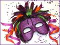
I think that if I HAD to chose something that could use work, it would be that I wish that some of the purple feathers didn't seem so dark. There was the suggestion of some extra lighting on them, which could work.
I think that a darker background is a bad idea, because the feathers on top are already dark, and the dark background would make this blend in too well, and make it a mushy mess. lol
The focus and clarity are good. I like the detail in the mask, and the sequins and ribbon are nice and crisp. Detail is simply great.
I like the angle and framing/cropping as well. The centered subject here is alright due to the angle of the mask. This creates the dramatic angle that I believe keeps it from being "too centered". Had the mask been straight, I think that would be boring and too centered, however, just that slight tilt was enough to make a world of difference.
Lighting is perfect. I like the little flecks of light on the ribbon and forhead ornament, and I like the shadows created by the mask, and ribbon.
Put this all together, and you have a really excellent image. And you do! I could see this on the front of a birthday card, or party invitation. As is, no changes. It's great.
Congrats on a job WELL done.
~Heather~