| Image |
Comment |
| 07/25/2005 08:36:29 AM |
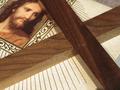
The wooden cross roadby VanGoghComment by Jutilda: With the cross cropped as it is, it looks almost like an X instead of a true cross. Maybe pan back just a tad. The similar colors of the portrait and the wood are complimentary and the lines of the document run parallel with the cross piece, creating an interesting parallel effect. |
| 07/24/2005 07:13:35 PM |
Gathering the family dinnerby VanGoghComment by jtf6agent: Nice idea with the bees collecting pollen for the family. Picture itself could use a bit more contrast. It appears a bit soft and flat. Nothing really jumps out and grabs the viewer. Focusing on one of the bees may have been helpful. The colors are very nice and had the bees been better focused would have worked very well. Composition is nice. It looks as though a better angle would have been a bit to the left although I don't know what the background had to offer. Overall it a fairly nice shot. The flower itself is beautiful. Keep up the good work. |
| 07/23/2005 09:57:34 AM |
|
| 07/22/2005 03:19:14 PM |
|
| 07/22/2005 02:23:14 PM |
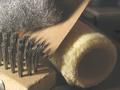
Soft, rough and sharpby VanGoghComment by aznym: This certainly would have been a great shot if you managed to give it proper processing. Right now, even the dark shadows are so creamy that you feel like screaming. You have adjusted the tones in to to the point where I am having a hard time trying to understand how you can possibly achieve this. Black is present in a few dots, but the rest is just hazy.
I don't know if it's your monitor that's showing you something different or you have actually chosen to present it this way, but to me it looks really odd. A lot can be done to this image and it can be made so much better. Although I don't know, I feel that calibrating your monitor is the first step. |
| 07/22/2005 01:03:23 PM |
|
| 07/22/2005 05:43:19 AM |
Soft, rough and sharpby VanGoghComment by bullethead: Nice idea, but the composition is litte jumbled for my taste. Also the colour is a bit washed out - stronger shadows would help it I think. |
| 07/21/2005 08:52:19 PM |
|
| 07/21/2005 07:16:07 PM |
|
| 07/21/2005 06:23:11 PM |
Soft, rough and sharpby VanGoghComment by loriprophoto: A nice idea but the shot is a bit flat, try upping the contrast so that it looses the grey overlay look, it will give the shot more punch. Focus looks good. |
Home -
Challenges -
Community -
League -
Photos -
Cameras -
Lenses -
Learn -
Help -
Terms of Use -
Privacy -
Top ^
DPChallenge, and website content and design, Copyright © 2001-2026 Challenging Technologies, LLC.
All digital photo copyrights belong to the photographers and may not be used without permission.
Current Server Time: 07/15/2026 04:14:55 PM EDT.