DPChallenge: A Digital Photography Contest You are not logged in. (log in or register
 
Browse Settings
Currently viewing:
Registered Useranthonyczaja

Show comments:

Per page:

Order:

Comments:


Comments Received by anthonyczaja
Pages:   ... [87] [88] [89] [90] [91] [92] [93] ... [135]
Showing 891 - 900 of ~1342
Image Comment
Indusrial Irradiation
12/02/2005 07:59:20 AM
Indusrial Irradiation
by anthonyczaja

Comment by popdeepop:
Not sure what we have but the factory feeling is present.
Indusrial Irradiation
12/01/2005 02:39:48 AM
Indusrial Irradiation
11/30/2005 12:41:32 PM
Indusrial Irradiation
by anthonyczaja

Comment by Stemo:
I see where you are going but the scale and focus take away from the mysterious quality.
Photographer found comment helpful.
Friendship
11/29/2005 10:51:31 PM
Friendship
by anthonyczaja

Comment by KiwiShotz:
Good use of props. Is a little difficult to read the image story but certainly odd
Goldie Locks Winks
11/26/2005 08:26:41 PM
Goldie Locks Winks
by anthonyczaja

Comment by e301:
from the outer edges of the Critique Club

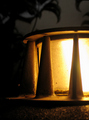
this seems odd, especially from someone with the evident appreciation of light and control of exposure and processing you've evinced in your previous submissions - that you'd miss the colour temperature aberration in the right-hand frame, that you'd have accepted the really quite bland light of the first two ... doesn't make sense, somehow.

Beyond all of that, of course, is the absolute cleverness of this image. One of very very few in which the three frames actually work for the entirety of the presentation, instead of just being a imposed mechanism. That trick I really like. You know what? If you'd taken this all to black and white you'd have done better with the voters: this kind of everyday tonality, whilst it does in some senses work to make the composition the more extraordinary, also serves to make the more obviously technical factors more noticeable - people think they understand colour so much more than they think they understand b/w, and also will accept much more experimentation in a black and white presentation. That, and a bit more punch overall - a bit more contrast at least.

I do like it - just the idea and the execution of it compositionally are enough to keep me looking. I wish, given the arty trick you've pulled so well, that you'd given it more of a chance with the voting public here. Well, from a long prowl through your portfolio, I'd say the ribbon(s) can't be far off - I'll be watching.

Ed
Friendship
11/24/2005 12:32:08 PM
Friendship
by anthonyczaja

Comment by saintaugust:
an auto white balance on ps might have helped the colour cast on this, which i dont find very pleasing
Friendship
11/24/2005 08:22:32 AM
Friendship
by anthonyczaja

Comment by temba:
A good idea and definitely representing oddness. The lighting seems good too, although it's a shame you've cut off the zebra's back - I wonder if there was a reason for that?
Photographer found comment helpful.
Friendship
11/24/2005 05:25:53 AM
Friendship
by anthonyczaja

Comment by Jammur:
Good use of warm WB, makes it more affectionate.
Photographer found comment helpful.
Friendship
11/23/2005 12:54:46 AM
Friendship
by anthonyczaja

Comment by stare_at_the_sun:
No way...I have the same cat thingy. Righteous.
On Your Marks... Get Set...
11/22/2005 08:51:06 PM
On Your Marks... Get Set...
by anthonyczaja

Comment by mycelium:
I think this would be a lot stronger if the frog were shot in habitat. Interesting choice of framing - makes it kind of cinematic.
Photographer found comment helpful.
Pages:   ... [87] [88] [89] [90] [91] [92] [93] ... [135]
Showing 891 - 900 of ~1342


Home - Challenges - Community - League - Photos - Cameras - Lenses - Learn - Help - Terms of Use - Privacy - Top ^
DPChallenge, and website content and design, Copyright © 2001-2025 Challenging Technologies, LLC.
All digital photo copyrights belong to the photographers and may not be used without permission.
Current Server Time: 08/16/2025 11:02:05 PM EDT.