| Image |
Comment |
| 01/08/2010 12:51:26 PM |
|
 Photographer found comment helpful. Photographer found comment helpful. |
| 01/08/2010 12:43:10 PM |
|
| Photographer found comment helpful. |
| 01/08/2010 11:37:33 AM |
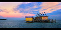
Solitude in Stiltsvilleby yakatmeComment by one2one: Colours look un-natural to me. Lack of contrast in the sky may be hurting this image too. Do you have any shots of this at a later time, like 15 minutes or so? Skies would surely look better with some darker blues. But you were rocking in a boat so I guess they're all blurry since you needed to shoot at an even slower speed. lol Did you think about climbing onto the dock itself for a shot? |
| Photographer found comment helpful. |
| 01/08/2010 11:33:20 AM |
Solitude in Stiltsvilleby yakatmeComment by Louis: Technicals aside, I can't connect at all with this. And I love the water, as can be seen from my portfolio. I found the wiki quote you provided very interesting. Had I known what this was, and what it's history meant, I might have connected; but that might not have been good enough to make it a good photo for me, with respect to impact. |
| Photographer found comment helpful. |
| 01/08/2010 09:56:01 AM |
Solitude in Stiltsvilleby yakatmeComment by Neil: Per the thread request--I think the main production issue is that the light is, or seem, flat. Also, might be a matter of interest with the structure. Personally, I'd have gone and shot the lighthouse! |
| Photographer found comment helpful. |
| 01/08/2010 09:01:57 AM |
Solitude in Stiltsvilleby yakatmeComment by glad2badad: Responding to thread request...
I gave it a 6. Thought it was "ok" overall and hovered between the 5 & 6 button on this one.
Couple of things for me that held this back:
1) Aspect ratio and the composition. It seemed like you were trying to tell two stories here; the lighthouse and the water structure. End result was an awkwardly balanced comp. The letterbox border was the right choice, given the comp, but I would have really beefed up the top and bottom black borders by another 30-40 pixels at least to offset the wide presentation.
2) Something about the colors. Looks like a levels adjustment is needed. The colors seem a tad forced and the lighting a little flat.
Those are some quick observations. Hope they're somewhat helpful. |
| Photographer found comment helpful. |
| 01/08/2010 08:59:32 AM |
|
| Photographer found comment helpful. |
| 01/08/2010 08:52:00 AM |
Solitude in Stiltsvilleby yakatmeComment by CNovack: The first time I ever saw Stiltsville was on Miami Vice while living in L.A. ...now that I am in the state I see it featured in the papers from time to time. To locals this capture would instantly grab our attention - to the larger (inter)national public the picture will have to work harder to capture and captivate attention. Critiquely looking at the photo it is slightly above average but needs some extra 'umph' to put push it into the 7-9 score category. The thing about the sky is that those colors are almost in competition with the hues on the building (certainly true of the pinks) and the blueish hues of the ocean - thus not letting the building truly pop off the page nor having the ground (sea) plane stand out/separate from the sky portion. I have seen spectacular sunrise and sunset colors in the sky down here so I am spoiled in the fact that Mother Nature could have done a better job for you on this day:-) Don't you just wish that you could have Mother Nature on speed dial on your phone to ask her to give you a better backdrop to work with?:-) (I know I wish I did). Some other have said the composition of elements could be better. Perhaps a bit more cropped so that the Stiltsville house dominates (and slighter bigger in view) the far right third of the photo. Keep the lighthouse in the far left of the photo. As you have it now the house looks like it is 'facing' and looking at the lighthouse and shore in the far off distance. Cropping and bringing us closer in how you compose the elements will just make that imagery of the Stiltsville house gazing at the lighthouse in the distance all the more stronger. Message edited by author 2010-01-08 08:55:12. |
| Photographer found comment helpful. |
| 01/08/2010 08:21:01 AM |
Solitude in Stiltsvilleby yakatmeComment by Delta_6: It really just doesn't grab me. The building doesnt stand out, the sky colour is nice but the blue clouds detract from it a lot, it's really just an average picture. That being said you have absolutely NOTHING to complain about if 5.1 is your second lowest score. This shot's score is higher than my average vote received. |
| Photographer found comment helpful. |
| 01/08/2010 08:17:25 AM |
Solitude in Stiltsvilleby yakatmeComment by paynekj: I have to echo most of what oscarthepig has said. Your subject building isn't aesthetically pleasing to me and leaving aside my strong dislike for this style of border, I'd like to know why you cropped it this shape - more of the sky please. |
| Photographer found comment helpful. |
Home -
Challenges -
Community -
League -
Photos -
Cameras -
Lenses -
Learn -
Help -
Terms of Use -
Privacy -
Top ^
DPChallenge, and website content and design, Copyright © 2001-2026 Challenging Technologies, LLC.
All digital photo copyrights belong to the photographers and may not be used without permission.
Current Server Time: 06/12/2026 11:10:19 AM EDT.