| Image |
Comment |
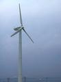
| 06/11/2003 01:49:07 PM |
|
| 06/11/2003 12:19:42 PM |
|
| 05/22/2003 01:34:45 PM |
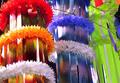
The Colors!by AntithesisComment by HBunch: *Critique Club*
This shot is a little busy for me. The part that bothers me most is the tree branch that pokes in front of the blue and yellow decorations. The colors are good, but I think that for this challenge there are too many, and the right ones are not the center of attention here. You have cut the red one off at the top of the frame. I do think that the red one should be in the shot more.
The lighting is a big harsh on the left side of the shot. It completely washes out the color in some spots.
I think that the angle is ok. It's not a dead on shot, which does create some interest.
The yellow seems more like a yellow green, but that doesn't bother me at all. I think that with the other colors in the shot, the yellow/green works better than a regular yellow.
Focus and clarity are good. Nice crisp lines. I like the detail in the flowery rings around the ribbons.
I guess it's technically alright except for the lighting, but it's just not my cup of tea.
~Heather~ |
 Photographer found comment helpful. Photographer found comment helpful. |
| 05/18/2003 04:56:46 PM |
The Colors!by AntithesisComment by kiwiness: Wow colorful! I think you represented most colors on the spectrum here! Verty sharp and detailed, good one. |
| Photographer found comment helpful. |
| 05/17/2003 11:25:13 PM |
The Colors!by AntithesisComment by karmat: I like the colors here, and the strong vertical "motion" However, at the risk of sounding nitpicky, I do think it would have been more effective (for this challenge, anyway) to include only the primary colors adn not a wide spectrum. But that's probably just me. |
| Photographer found comment helpful. |
| 05/16/2003 01:32:16 PM |
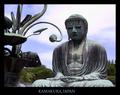
Great Buddahby AntithesisComment by myqyl: ~ Critique Club Comment ~
Composition : Extraordinary... The positioning of Buddha's head on the "rule of thirds" grid is achieved with a certain something that makes it look very natural and un-contrived. The rest of the frame is filled with interesting curves and lines. Wonderfully done!
Exposure / Lighting : I think the people that mentioned the lack of light on Buddha's face have a point. That may have been the "little extra" needed to escalate this shot to the top. I have never had the pleasure to visit this site, so I'm not sure if a different time of day would have given you better lighting or not. But if you have an opportunity to spend more time here, you may want to shoot a few at different times of day. Particularly early morning or late afternoon, depending on which direction he is facing.
Focus : Flawless.
Post Processing : Extremely professional looking border. Very well done.
Challenge / Wow : The challenge is certainly nailed here. I could easily imagine this shot on a postcard at a vendor. A slightly better lighting situation would have truly nailed the "wow" as well.
My opinion : Great shot! One very small nitpick and I'm not even certain I'm right... Is the title misspelled? I thought it was "Buddha"... I could be wrong and it doesn't make much difference either way :) |
| Photographer found comment helpful. |
| 05/15/2003 10:10:16 PM |
The Colors!by AntithesisComment by dacrazyrn: Looks like Prom decorations. Nice color and composition. A touch harsh lighting in the left side on the tops of the lai's (sp). The red looks a bit washed out from it |
| Photographer found comment helpful. |
| 05/13/2003 11:28:43 PM |
|
| Photographer found comment helpful. |
| 05/13/2003 10:46:16 PM |
|
| 05/13/2003 06:56:24 PM |
|
Home -
Challenges -
Community -
League -
Photos -
Cameras -
Lenses -
Learn -
Help -
Terms of Use -
Privacy -
Top ^
DPChallenge, and website content and design, Copyright © 2001-2026 Challenging Technologies, LLC.
All digital photo copyrights belong to the photographers and may not be used without permission.
Current Server Time: 07/16/2026 05:14:01 AM EDT.