| Image |
Comment |
| 08/08/2005 04:18:12 PM |
Self Portraitby kjenningsComment by RobotBanjo: One of the best self portraits if you don't mind me saying. I love the personality and tones. Not TOO fond of the glasses ;) but I dig the shirt. Great job. |
 Photographer found comment helpful. Photographer found comment helpful. |
| 08/08/2005 04:17:02 PM |
|
| Photographer found comment helpful. |
| 08/08/2005 03:29:30 PM |
Nasty Bendby kjenningsComment by singe: I like the selective desat on this, and the composition is nice and tight as well. That sign is kind of distracting, though - have you tried cloning it out? Good image overall, though. :) |
| Photographer found comment helpful. |
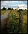
| 08/08/2005 02:12:15 AM |
Life on the Farmby kjenningsComment by shabbychic: Great job with the picture.. I'd suggest spicing up the rain clouds to make it more moody, it usually seems to be a favorite amongst clouds in pictures.
I really like this photo- it reminds me of home! :-) |
| Photographer found comment helpful. |
| 08/08/2005 01:15:37 AM |
|
| Photographer found comment helpful. |
| 08/08/2005 01:02:36 AM |
|
| Photographer found comment helpful. |
| 08/08/2005 12:52:05 AM |
Self Portraitby kjenningsComment by Art Roflmao: Nice job! I like the angle and the effects / post-proc. ...wait a minute - is that a pink shirt?? Didn't you ever see that episode of the Simpsons where Homer wore a pink shirt?? :P
Welcome to DPC membership! Did they tell you about Hell Week? ;-) Message edited by author 2005-08-08 00:52:21. |
| Photographer found comment helpful. |
| 08/05/2005 11:13:06 AM |
A Shocking Professionby kjenningsComment by Gil P: since you're wondering why you got some low scores... I would rate this image a 4. here's why:
The image is technically fine but obviously shot at the wrong color temp.. ty-raps are white and are showing orange on your shot.
Compositionally, the image is very busy with not directional dynamics there are no clear points of interest.
lastly there is no perspective and this create an absolute flatness which is obviously not the case as the materials are stacked. |
| Photographer found comment helpful. |
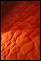
| 08/05/2005 09:41:37 AM |
A Feeling of Warmthby kjenningsComment by LadeeM: So, you've heard over and over again about the DOF. I have to agree. I love the textures, and the colors, but the POF is confusing. Again, try different angles and apertures and use the one you look and like the best. That doesn't mean everyone else likes it, but you know you've posted a photo that touches you. |
| 08/05/2005 09:38:57 AM |
Before Digitalby kjenningsComment by LadeeM: The composition of this one is great, I just have to agree with the darkness. I think more of a contrast would have worked well for this one, like against a white or maybe even a gold background. I'd try a few different ones. When I enter a challenge, I drive my family crazy because I use about 3 different backgrounds, 4 different views, and click about 40 different photos. :) My husband just shakes his head at me and walks away. LOL |
Home -
Challenges -
Community -
League -
Photos -
Cameras -
Lenses -
Learn -
Help -
Terms of Use -
Privacy -
Top ^
DPChallenge, and website content and design, Copyright © 2001-2026 Challenging Technologies, LLC.
All digital photo copyrights belong to the photographers and may not be used without permission.
Current Server Time: 07/16/2026 01:05:08 AM EDT.