DPChallenge: A Digital Photography Contest You are not logged in. (log in or register
 
Browse Settings
Currently viewing:
Memberdavidw

Show comments:

Per page:

Order:

Comments:


Comments Received by davidw
Pages:   ... [139] [140] [141] [142] [143] [144] [145] ... [222]
Showing 1411 - 1420 of ~2212
Image Comment
February Zen
03/11/2010 10:55:32 PM
February Zen
by davidw

Comment by macrothing:


Critique Club Critique

First Impressions
Ohh - nice.

I didn't get to this one during voting, but hypothetically would have been at least an 8 from me. I like your title, very apt.

Photograph Information, Technicals & Composition Review
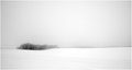
I'd hazard a guess that you are very pleased with the end image here, based on your comments. This would be lovely as a big big canvas type (or whatever) wall sized in a room. Very peaceful and relaxing, easy to wander off to another place.

Technicals all seem very sound, especially seeing that this is likely the end result you were wanting. The shallow DOF works well. I can't quite decipher if it is snowing or mist or fog or what, perhaps it is there 'larger', who knows - but the end effect of 'haze' (for want of a better word) adds to the feel in the image and works well, in my opinion.

The toning is good, maybe a little more definition here and there - don't know, would likely change it too much and create just 'another' image. The main reason I mention this is that the 'flat' b&w just seems... 'plain' - but that's the whole idea. Simplicity in scene and presentation of such (guessing here, or it is my interpretation).

Composition is good, I like the way it trails off to the right.

Comments, Score & Placement Review
148/378 is a bit of a shame, I guess not enough voters stopped to appreciate this image/scene - or perhaps they did but it didn't connect with them... who knows.

7.66 from your commenters - all of which were in unison it seems. I'm a little surprised the average from them wasn't higher... but there ya go.

Summary
It's good. Print it.
Photographer found comment helpful.
On the Siding
03/11/2010 01:58:28 PM
On the Siding
by davidw

Comment by Luci11e:
different prespective - good textures - wonderful colors - perfect lighting - you get an A :-)
Photographer found comment helpful.
untitled
03/11/2010 12:22:15 PM
untitled
by davidw

Comment by skewsme:
a nice example of selective desat enhancing an image
Photographer found comment helpful.
March Tree
03/11/2010 06:39:50 AM
March Tree
by davidw

Comment by kellymk:
I think this is cool, very interesting tree shape and I like the way you've treated it, with the exaggerated contrasts, and the stripped out ground.
Photographer found comment helpful.
untitled
03/11/2010 12:53:44 AM
untitled
by davidw

Comment by chazoe:
excellent color.
Photographer found comment helpful.
On the Siding
03/10/2010 11:25:13 PM
On the Siding
by davidw

Comment by HarveyG:
Nice perspective, pity it's washed out.
Photographer found comment helpful.
March Tree
03/10/2010 11:03:31 PM
March Tree
by davidw

Comment by PennyStreet:
Interesting bend to the tree and good processing gives this a lonely look.
Photographer found comment helpful.
March Tree
03/10/2010 03:36:50 AM
March Tree
by davidw

Comment by SoulJance:
nice shot I really like the starkness of the shot. I would have been tempted to put a slight vignette around it. I would also consider removing buildings in the back ground or shot the tree from a lower perspective so that the branches were not over the top of the buildings.
Photographer found comment helpful.
untitled
03/09/2010 11:58:00 PM
untitled
by davidw

Comment by Ja-9:
I like the focus on the grass and the contrast with the background...but to me it seems that you could loose most of the left side of the picture without harming it at all...in fact to me it seems like it would really strengthen it
Photographer found comment helpful.
untitled
03/09/2010 06:44:36 PM
untitled
by davidw

Comment by Louis:
Yeah, this is beautiful. I don't like it for the obvious allegory, but I like it for the sparseness and the gentle curves. Even more negative space at top would have made this a real winner for me; if the sky was weighing down on the lightness of the scene, and the white hill was just a little less in view, and the whole thing just pushed down slightly. I would have been touched by that. But thanks, this is very pretty.
Photographer found comment helpful.
Pages:   ... [139] [140] [141] [142] [143] [144] [145] ... [222]
Showing 1411 - 1420 of ~2212


Home - Challenges - Community - League - Photos - Cameras - Lenses - Learn - Help - Terms of Use - Privacy - Top ^
DPChallenge, and website content and design, Copyright © 2001-2025 Challenging Technologies, LLC.
All digital photo copyrights belong to the photographers and may not be used without permission.
Current Server Time: 08/15/2025 01:06:40 PM EDT.