RRRRRibbit!by
mimsydotesComment by diablo2097: Critique Club
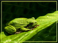
Composition
Excellent composition, placing of the frog is perfect. i really like the contrasting shadows and light, but the only thing is i'd have really liked to get rid of the shadow covering the backside of the frog. Also, i like the leading lines of the leaf. The texture of the frog shows up really nicely.
Technical
DOF is good, but the back of the leaf is a bit oof in a distracting way, not najorly, but just a little. Lighting is great, bringing out frog texture. Picture is overall technically quite nice.
Post processing
Firstly, i have to say... the DPC size limit is 640!!! please use all 640 pixels, as I think you would have lost a lot of votes because of this. Love the colours, you've got those down really nice. Personally i used to like borders, but i'm not sure if this would be better with or without. Personal taste i guess. In terms of sharpening, i'm not sure if you went a teensy bit overboard on the frog, as he's looking a little bit pixelated near his head, but thats just nit picking.
Hope this helped, and i think the biggest 2 things to improve shot would be, a) bigger photo, b) no shadow on frog's butt.
Enjoy, and feel free to pm me