| Image |
Comment |
| 11/08/2014 09:43:15 AM |
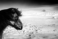
Back to the windby boguloComment by HarveyG: Amazing image in very harsh conditions. There should be extra points awarded for technical ability in harsh conditions... |
 Photographer found comment helpful. Photographer found comment helpful. |
| 11/07/2014 10:47:13 AM |
|
| Photographer found comment helpful. |
| 11/07/2014 10:13:56 AM |
|
| Photographer found comment helpful. |
| 11/07/2014 01:06:42 AM |
|
| Photographer found comment helpful. |
| 11/06/2014 11:31:44 PM |
Back to the windby boguloComment by Phocal: Wonderful control of the dark horse(?) against the snow. Love how the snow surrounds the eye and helps draw the eye towards his eye. Very well done. |
| Photographer found comment helpful. |
| 11/05/2014 05:39:26 PM |
|
| Photographer found comment helpful. |
| 11/05/2014 07:47:16 AM |
|
| Photographer found comment helpful. |
| 09/23/2014 07:32:25 AM |
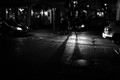
Saturday nightby boguloComment by JakeKurdsjuk: Critique Club Comment:
Very nicely seen and shot. This is one of those photos that suffers greatly due to the constraints of this website. As presented there are many details here that are not apparent, for when I critique I always take a copy of the photo and open it in Photoshop to test any suggestions I might make, and as I opened it I saw things I could not see (and still cannot) on the same monitor as presented here. I suspect it's seeing it against the light gray background of DPC vs. the dark gray of PS. My point being that the impact of monitor calibration (or lack thereof) across the breadth of the voters, when combined with what I pointed out regarding the differences against light and dark backgrounds, may be what's responsible for the amazingly wide array of votes you've received. I suspect a notch of the midtones to the brighter side in Silver Efex may have remedied that, particularly given the number of "too dark" comments below.
As for the photograph itself, the huge variety of lines going in all directions is what makes this image both interesting and problematic. People with "level horizon OCD" look for a grounding point when there are lines, and what struck me when I opened this in Photoshop is that the one thing that is straight - the sign - looks absolutely skewed when I don't have a grid overlay turned on. While these lines are wonderful (even for someone with my condition), they do distract from the one actual shadow (as opposed to darkness, which I realize is also "shadow") that appears in the photo. As lit, the shadow simply exists along with the other darkness, which is not a problem unless you factor in that voters were looking for "shadows". I think a notch in the midpoint light to brighten the entire scene a hair coupled with a darkening of the central shadow against the headlight reflection may have gotten you some extra points from those who are on the lower end of the curve. I know it would have brought my 5 up to a 7 or 8, easily.
Again, there's not a lot I don't like about this photograph seeing it properly. My only criticism is in light of the challenge parameters, and the format in which it's presented here. Nicely done. |
| Photographer found comment helpful. |
| 09/16/2014 10:55:20 PM |
|
| Photographer found comment helpful. |
| 09/14/2014 02:25:19 PM |
Saturday nightby boguloComment by Revecca: Such simple shadow but yet highly effective and creates a beautiful scenery that makes me want to take a walk downtown..
I'm assuming this is  jagar jagar because this resembles his amazing work, and if not then take t hat as a high compliment. |
| Photographer found comment helpful. |
Home -
Challenges -
Community -
League -
Photos -
Cameras -
Lenses -
Learn -
Help -
Terms of Use -
Privacy -
Top ^
DPChallenge, and website content and design, Copyright © 2001-2026 Challenging Technologies, LLC.
All digital photo copyrights belong to the photographers and may not be used without permission.
Current Server Time: 05/05/2026 03:47:11 PM EDT.