| Image |
Comment |
| 11/15/2005 09:51:30 AM |
|
| 11/15/2005 03:06:15 AM |
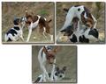
Dog 1, Pup 0by mksnowhiteComment by tonyv: This layout doesn't work for me. Looks like a page out of a photo-album and not like something that could be hung on the wall. |
| 11/15/2005 03:04:03 AM |
|
| 11/15/2005 02:54:18 AM |
Dog 1, Pup 0by mksnowhiteComment by ladyhawk22: Good clear pics with nice lighting. The triptych frame is a little different than I'm used to. Colors on the dogs look great and you've captured some cute scenes. |
| 11/14/2005 10:10:24 PM |
Dog 1, Pup 0by mksnowhiteComment by jduffett: This is a fabulous sequence of photos! I'm not very keen on the layout, but does allow you to make each of the three bigger than you could otherwise, which is helpful. |
| 11/14/2005 09:42:27 PM |
|
| 11/14/2005 08:44:04 PM |
|
| 11/14/2005 07:05:40 PM |
|
| 11/14/2005 05:12:33 PM |
Dog 1, Pup 0by mksnowhiteComment by macrothing: 7 - Very good. Another good use of the triptych to show a 'range'. Criticism; undecided on the framing/placement choice, it works but, if possible, depending what you had to work with, the bottom one full width, may have balanced this out better, or rather reduced the 'dead space' there. I do like the bottom shot though, good capture - as is on all. Good colors and contrast control. Just a touch more contrast in the bottom one as is with the top two, would also have made this better in my opinion. |
| 11/14/2005 03:27:54 PM |
|
Home -
Challenges -
Community -
League -
Photos -
Cameras -
Lenses -
Learn -
Help -
Terms of Use -
Privacy -
Top ^
DPChallenge, and website content and design, Copyright © 2001-2026 Challenging Technologies, LLC.
All digital photo copyrights belong to the photographers and may not be used without permission.
Current Server Time: 07/15/2026 07:40:40 PM EDT.