| Image |
Comment |
| 08/29/2005 07:04:27 PM |
|
 Photographer found comment helpful. Photographer found comment helpful. |
| 08/27/2005 10:10:04 PM |
|
| Photographer found comment helpful. |
| 08/27/2005 05:03:19 PM |
|
| Photographer found comment helpful. |
| 08/27/2005 04:47:30 PM |
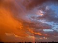
God's Promiseby AtroposComment by rasdub: I agree with your remark about the shot could have been more clear, but I do like this. The colors are really nice. |
| Photographer found comment helpful. |
| 08/27/2005 04:15:51 PM |
Shadowby AtroposComment by benhur: great shadow on this image, nice to see it all in the pic.
a tall letter box may work well on this one cropping off upto the edge of the glassed on the right and to the shadow on the left. |
| Photographer found comment helpful. |
| 08/27/2005 04:09:44 PM |
God's Promiseby AtroposComment by benhur: I like the way you have got very little landscape in this one, and the rainbow is a kind of dividing line in the colours in the sky.well seen |
| Photographer found comment helpful. |
| 08/27/2005 08:52:07 AM |
The Beaconby AtroposComment by Jutilda: I love this - would like to see it a little less centered with more dark to one side. You made it look just like it was night! Isn't PS grand? |
| Photographer found comment helpful. |
| 08/27/2005 02:34:26 AM |
Rusty Hydrantby AtroposComment by taterbug: Good eye here. Nice subject. Again, maybe a little usm, seems like it could be a little sharper. I actually like the grain in this case, I think it works well for this image. I also think this is a case where the centered composition works very well for the photo. Might even try cropping out just a touch of the bottom, making it a little more symetrical, and even strengthen the bold centered presentation. Nice job, look forward to seeing more of your stuff :-) |
| Photographer found comment helpful. |
| 08/27/2005 02:26:43 AM |
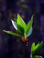
Beginningby AtroposComment by taterbug: May be a plain subject, but I find it pleasing to the eye. You have presented it well. There is no clutter, or business, you've kept it simple and shown what you want the viewer to see. Good dof, and that is good lighting. I like the color where the leaves bud off the stalk. If you havn't already applied it, a light pass of usm might bring out just a tad bit more detail. Your framing is good, like I said, attention is definitely on the plant, but something that might even strengthen this presentation, is to show just a little more of the plant at lower right, and a little less space at top. The reason I say this is, that in this case, I don't feel the space serves a strong purpose and if you did that, then the plant would be out of the center and fall on a thirds intersection (rot). Also, I think the lower plant adds a little interest and 'context' to the image, might be nice to see a bit more of it. But overall, yes, a nice job. Maybe a plain subject, but presented well, not hard to view at all. :-) |
| Photographer found comment helpful. |
| 08/27/2005 12:58:58 AM |
Beginningby AtroposComment by SDW: Very nice picture. I love the broken effect. The lighting is good as well as the color. The focus is very nice. Great Job! |
| Photographer found comment helpful. |
Home -
Challenges -
Community -
League -
Photos -
Cameras -
Lenses -
Learn -
Help -
Terms of Use -
Privacy -
Top ^
DPChallenge, and website content and design, Copyright © 2001-2026 Challenging Technologies, LLC.
All digital photo copyrights belong to the photographers and may not be used without permission.
Current Server Time: 07/16/2026 07:43:47 PM EDT.