| Image |
Comment |
| 07/09/2006 05:44:25 PM |
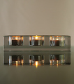
Glass Candle Holder on a Glass Tableby chaliceComment by kirsty_mcn: -trading post-
Whilst there doesn't seem anything "wrong" with this, it doesn't seem to have much punch imho. Theres an awful lot of grey, and I'm not 100% convinced about the focus, although that may be just because of looking through the glass.
I think it would have been a lot stronger with a touch of colour, because the composition does have a nice zen feel to it, and definitely has potential |
 Photographer found comment helpful. Photographer found comment helpful. |
| 07/09/2006 05:30:58 PM |
Eye of Godby chaliceComment by kirsty_mcn: Hey, I added this to my favourites straight away even though I didn't have time to comment. This is my favourite of your entries so far, even if not the highest scoring. ITs a beautiful abstract, I love the rich colours and the clarity/sharpness of the patterns in a kinda cubistey way, rather than everything being completely blurred.
Not sure what I could suggest to improve it... possibly (although I know its partly trial and error) it may have been better with more of the yellow bit, which gives it more of an eye/seashell shape rather than the more circular shape.
Definitely underrated, but you can pretty much expect that for an abstract here. You should be very pleased with it nonetheless |
| Photographer found comment helpful. |
| 07/09/2006 05:06:04 PM |
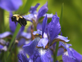
Flight of the Beeby chaliceComment by kirsty_mcn: Sorry to be so late with critiques
I think you've succeeded well in capturing the bee with the flower, and enhancing it with b/g bokeh. The colours and the focus on the flower are good. The main problem here for me is that the bee is soft - I'm not sure if that is motion blur or if the bee is outside the plane of focus. I would also prefer the background flowers to be slightly further away (or shallower DOF) to enhance the bokeh.
Also, a slight change in placement could have put the b/g flowers offset against the f/g flower, making the composition a touch less busy.
I would suggest cropping in the righthand side so that the flower is not centralized. |
| 07/09/2006 04:59:05 PM |
|
| Photographer found comment helpful. |
| 07/08/2006 10:43:36 PM |
Flowers on a Glass Tableby chaliceComment by MTPixels: Interesting reflection effect here. I may have liked it better if you had rotated the image. 90 degrees tot he right. Nice though. Well done. |
| Photographer found comment helpful. |
| 07/08/2006 06:43:14 PM |
|
| Photographer found comment helpful. |
| 07/08/2006 12:39:35 PM |
Eye of Godby chaliceComment by Melethia: Trading Post comment
First, I apologize, as I missed this when I went through earlier this week to comment - I tend to forget the challenges I didn't enter or vote in. Second, this won't be a totally unbiased comment, since I found out I missed this by reading a comment you made in a forum thread. All that said... I do like this. I'm not generally a fan of abstracts, but I do like a good one now and then, and this is a good one.
With a lot of abstracts, I find myself compelled to figure out what it is - I don't seem to need to do that here. I like it as is, without worrying *what* it is. And contrary to some of your comments, I do like the gold in the corner - adds a spark that lights this up. I'd say this is a very successful experiment! |
| Photographer found comment helpful. |
| 07/08/2006 06:40:41 AM |
|
| Photographer found comment helpful. |
| 07/07/2006 05:52:45 PM |
|
| Photographer found comment helpful. |
| 07/07/2006 03:58:27 PM |
Eye of Godby chaliceComment by timfythetoo: Greetings from the Critique Club -
OK - So i gave you a pretty detailed comment from the trading post. And after reading that comment again it pretty much stands the same. I am not quite sure how to go about returning this to the pile to be commented on so what I will do is ask one of my friends to give you a comment on this as a replacement. Let me know if thats not cool and I will see what I have to do to get you back in line.
Tim
(copied just in case CC management looks to see if I did my job)
OK - as an abstract I think this shot works very well. Cool colors and textures. The yellow on the corner though should either be gone or have more of it. I see the little bit of it and want to see more of it. It has a contrasting look and feel to it compared to the rest of the pic. I had absolutley no clue what this was a picture of. But for the challenge it was tough to vote this high IMO. I personally felt that you needed to understand what the subject was to be able to relate to the movement. Spending more time looking at it now makes me feel that I may have scored it a bit harshly, but in the DPC voting world where you spend all of a second or two glimpsing at a shot this didnt grab me or make me want to stay to inspect it further. At voting time I thought it was not interesting or relevent as a motion blur shot. Looking at it deeper now and reading your description I can see what you were shooting for but I still think it would have done much better in an abstract challenge. |
| Photographer found comment helpful. |
Home -
Challenges -
Community -
League -
Photos -
Cameras -
Lenses -
Learn -
Help -
Terms of Use -
Privacy -
Top ^
DPChallenge, and website content and design, Copyright © 2001-2026 Challenging Technologies, LLC.
All digital photo copyrights belong to the photographers and may not be used without permission.
Current Server Time: 06/22/2026 02:56:57 PM EDT.