| Image |
Comment |
| 01/16/2006 10:17:37 PM |
Original Cin (namon)by Rae-AnnComment by jaaad: this looks GREAT. both the food and the picture. One of my favorite in the challenge. Can't wait to get the recipe |
 Photographer found comment helpful. Photographer found comment helpful. |
| 01/15/2006 08:08:35 PM |
Original Cin (namon)by Rae-AnnComment by JunieMoon: Seems a bit overexposed. The white flecks detract from the general appetizing look of the rolls. Perhaps you used too bright a light. Maybe a lower wattage, or positioning the light further away would have softened the flecks. Also, even just placing a handkerchief over the front of the light might have taken some of the sharp highlights away, or perhaps turning it away from the food and bouncing it off of a white board. Try different lighting ideas to get the right balance. |
| 01/15/2006 10:22:56 AM |
|
| 01/14/2006 10:56:48 PM |
|
| Photographer found comment helpful. |
| 01/14/2006 03:27:17 PM |
|
| Photographer found comment helpful. |
| 01/14/2006 03:08:17 PM |
|
| Photographer found comment helpful. |
| 01/14/2006 02:53:10 PM |
Original Cin (namon)by Rae-AnnComment by lmalins: nice perspective, nice colours, and great lighting, though some areas are just a bit too bright, which ruins it for me. Apart from that a great shot. |
| Photographer found comment helpful. |
| 01/13/2006 07:07:15 PM |
|
| Photographer found comment helpful. |
| 01/13/2006 12:13:57 AM |
Original Cin (namon)by Rae-AnnComment by Prism: The buns look yummy and I will be sure to check and see if you have posted this recipe! Nice colour on the strawberries. The silver utensil at the top of the photo is distracting as is the shadow and bit of other plate showing on the right top. |
| Photographer found comment helpful. |
| 01/12/2006 06:12:27 PM |
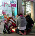
A City's broken heart - In Memory of Jane Crebaby Rae-AnnComment by DrAchoo: I think you had a good idea here. A few of my thoughts on improvement:
1) I don't mind square crops, but I'm not sure it works here. I think we want to see more in some direction, I'm just not sure which.
2) The upper left is blown. This is a tough exposure because of the backlighting from the store. Potentially even worse than the upper left is the upper right where the highlights look pretty unattractive. (For some reason they look like shoes on display to me...) It might not have been possible to do better; you could have underexposed some more and hoped to bring the people out in levels by adjusting midtones in Photoshop.
3) There's motion blur (I think) rather than DOF blur. You were on 1/4 second and I bet it was because of that. Pretty good actually for that speed. If this is, in fact, DOF, I would have made the shrine in focus because it is just as important to the picture as the people. personally I also use the rule of thumb that if something has writing on it I make it either very sharp or totally OOF. Semi-focused writing looks bad.
I gave you a 5 because of the emotional content of the picture rather than the technical merits. Keep going Rae-Ann, I know you'll get there. |
| Photographer found comment helpful. |
Home -
Challenges -
Community -
League -
Photos -
Cameras -
Lenses -
Learn -
Help -
Terms of Use -
Privacy -
Top ^
DPChallenge, and website content and design, Copyright © 2001-2026 Challenging Technologies, LLC.
All digital photo copyrights belong to the photographers and may not be used without permission.
Current Server Time: 07/16/2026 09:58:45 AM EDT.