| Image |
Comment |
| 12/31/2002 03:04:48 PM |
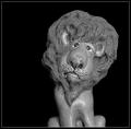
J O S Hby brandonarbiniComment by myqyl: This really pushes the border on "portrait"... It seems more appropriate for a "Still Life" challenge... That being said, I really like the composition... The lighting left a few hot-spots, but not overly distracting ones... |
| 12/31/2002 08:59:04 AM |
|
| 12/30/2002 02:09:20 AM |
|
| 12/30/2002 12:14:15 AM |
|
| 12/29/2002 04:33:41 PM |
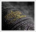
Gospel Studyby brandonarbiniComment by bod: Great use of colour and fantastic composition. Would have liked a *touch* more DoF to get all the text in focus, but the blurred out background is great.
The border doesn't match the image for me, in fact it's distracting and takes away rather than adds to the overall effect. Otherwise nice work. |
 Photographer found comment helpful. Photographer found comment helpful. |
| 12/29/2002 01:45:03 PM |
|
| 12/28/2002 01:38:10 AM |
|
| 12/26/2002 05:44:33 PM |
|
| 12/26/2002 12:09:15 PM |
|
| 12/26/2002 11:56:50 AM |
Gospel Studyby brandonarbiniComment by joanns: Just a little more DOF so that all the writing on the spine could be read would really make the shot for me. Wonderful idea and color. |
| Photographer found comment helpful. |
Home -
Challenges -
Community -
League -
Photos -
Cameras -
Lenses -
Learn -
Help -
Terms of Use -
Privacy -
Top ^
DPChallenge, and website content and design, Copyright © 2001-2026 Challenging Technologies, LLC.
All digital photo copyrights belong to the photographers and may not be used without permission.
Current Server Time: 07/15/2026 11:13:00 PM EDT.