| Image |
Comment |
| 02/15/2003 12:12:05 PM |
|
| 02/15/2003 11:58:20 AM |
|
 Photographer found comment helpful. Photographer found comment helpful. |
| 02/15/2003 09:21:42 AM |
|
| Photographer found comment helpful. |
| 02/15/2003 01:08:01 AM |
|
| Photographer found comment helpful. |
| 02/11/2003 05:18:30 AM |
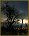
Sunset #16by zadoreComment by inspzil: Greetings from the Critique Club
by Inspzil
Composition - Sunsets are probably the most cliche of all shots, outside of DPC. Suprisingly we don't see that many probably due to a lot of the challenge topics. The composition of this photo should have included the whole tree, and probably a little more "padding" around it. The fence post directly in front of the sun is detracting from this picture substantially. This particular sunset is not very camera friendly due to the darkness of the clouds and the brightness of the sun. I don't think this was the greatest day to be capturing a sunset. There are a lot of dark clouds covering stuff up and make this sky look a bit menacing. It doesn't have that peaceful feeling of a sunset taken somewhere like Maui.
Photography - The exposure is tough to hit on this one. Most of the photo is pretty dark except where the sun is of course, and there its ultra bright. The exposure was obviously set to that judging by the F-number and shutter speed at which the picture was shot. Its not crisp like I think it should be either which may be another side effect of exposure settings.
Processing - I'm not sure if this picture was oversharpened a little or its something else, but the branches don't look right. It may have something to do with the camera's perception of light and dark. My first impression of this though is that it was oversharpened.
Overall - The mood of this picture is not what I expect it to be with a sunset. Its very dreary for a sunset. The composition needs some refining and probably should've been taken from further back or cropped a little less tight to include the whole tree. The photo quality of this image is not really that great either, for the most part due to the difficulty of properly exposing a picture like this (if it could be done. I couldn't do it.) In all honesty and without trying to be offensive, I think you were very fortunate to pull 5.6 out of this picture. Good luck in future challenges Z. - Bob |
| Photographer found comment helpful. |
| 02/10/2003 04:05:00 PM |
Rosesby zadoreComment by jmsetzler: Greetings from the Critique Club :)
Hi Zadore...
This is an interesting concept of before and after... Just one note of interest on the composition... General rule of thumb says that photos read like a book... left to right and top to bottom. You may have considered mirroring this image horizontally to compose the new fresh rose on the left (before) and the old dead rose on the right (after) just for the simple sake of creating a fluid composition to match the challenge title.
The glass in the bottom of the frame isn't really contributing much to the image. I would have considered cropping that part out possibly or recomposing the shot to eliminate that. It's shadow on the backdrop is a little strange looking also.
I do like the choice of the dark backdrop. Moving it a little further into the background would have reduced the dominance of the lighting on it and possibly, with a shallow depth of field, created some nice light gradient on the background...
Keep up the good work :)
John Setzler
|
| 02/09/2003 11:35:16 PM |
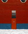
Door #13by zadoreComment by ClubJuggle: *Critique Club*
FIRST IMPRESSION: Elegant and simple. Proves that a photograph does not have to be complicated to be appealing. Striking color.
CHALLENGE: Unqiestionably meets the challenge.
COMPOSITION: At first glance, this photograph proves that you can break the rules and still have an effective composition, as the door and large window are almost centered left to right. This is not a criticism, though, as it works in this composition (in fact I think anything asymmetrical would fall short, the symmetry is what makes this shot). The rule of thirds is evident in the "13" as well as the placement of the doors and round windows. The inclusion of half of the round windows at the top of the frame is an excellent choice, as it adds visual interest to the top of the frame.
TECHNICAL: Your color is strong and vivid and really grabbed me right away. I think your white point should possibly be a little bit lower though (the snow seems a little dark).
CONCLUSION: Excellent shot, one that I thought was deserving of better than its 30th place finish.
Thanks for sharing and good luck in future challenges! |
| Photographer found comment helpful. |
| 02/09/2003 09:01:06 PM |
|
| 02/09/2003 06:24:05 PM |
|
| Photographer found comment helpful. |
| 02/09/2003 03:21:59 PM |
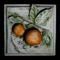
Stone Orangesby zadoreComment by briphoto: Ok, Phil, I hope you don't get too upset with me, remember, I can only give my opinion, and if I offend, it's not my intent. A couple people commented that the oranges seem to be the subject, not the tile, I have to agree with them. The photo does fit our theme for the competition, but just barely. Also, the subject of OPA was brought up, and I think that person had a good point. Your shot of the tile did not add anything to what somebody else had already done. Somebody commented that the whole image was not in focus, I don't see that. I did go check out your other photos at your profile and I know you are much capable of much better work. I hope some of my comments will be helpful to you! |
| Photographer found comment helpful. |
Home -
Challenges -
Community -
League -
Photos -
Cameras -
Lenses -
Learn -
Help -
Terms of Use -
Privacy -
Top ^
DPChallenge, and website content and design, Copyright © 2001-2026 Challenging Technologies, LLC.
All digital photo copyrights belong to the photographers and may not be used without permission.
Current Server Time: 07/19/2026 06:59:54 PM EDT.