| Image |
Comment |
| 07/31/2006 04:43:59 PM |
hamburger standby undieyatchComment by Claya: Nice job. Light bulbs add just enough color to satisfy my curiousity that is really is in color but not so much that it goes against the spirit of the challenge, you know B&W. |
| 07/30/2006 10:11:48 PM |
|
| 07/29/2006 07:21:43 PM |
|
| 07/27/2006 02:57:54 PM |
|
| 07/27/2006 07:04:02 AM |
|
| 07/26/2006 10:38:02 AM |
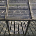
broken lightby undieyatchComment by posthumous: I gave this a 7. It's just a fascinating study of lines. It's "unprocessed" look makes it a mini-revelation. Look at the beauty that surrounds us! Or at least... look at the lines that surround us! |
| 07/26/2006 01:46:55 AM |
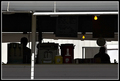
hamburger standby undieyatchComment by locutus: Yep, it's a hamburger stand, alright.
Of itself, it's a good shot, though not everyone will like the dominance of the shadows. I like the yellow of the incandescent lights, and the moody silhouette of the people. But it doesn't really say "black and white" to me. It's got lots of black and white, so it's hard to say DNMC, but... |
| 07/25/2006 06:41:51 PM |
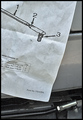
drag link memoby undieyatchComment by admart01: risky one here. The use of words/letters draws my eye to them (just the stuff on the bottom of the page) and I'm left struggling between reading and taking in the frame. I'm all around the frame - if I image the frame with the writing blurred or in characters I can't interpret, I get more of a sense of lines and angles with lots of gray. Feel the flat lighting was the way to go but it doesn't add any interest. |
| 07/25/2006 06:35:24 PM |
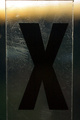
#by undieyatchComment by admart01: didn't vote in this one but this would have garnered a 7 from me. I like the boldness of the x, it is off-set by your trademark soft hues. The glass/plastic edge is a great element. I do agree with the comment on the loss of detail towards the bottom. It doesn't balance out the inteest created by the other three edges. My favorite aspect is that each element is slightly off-center -- inspired. |
| 07/25/2006 04:14:03 PM |
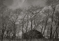
neglected houseby undieyatchComment by posthumous: apt title. the house is neglected by you as well! it is small and obscured, which emphasizes its basic shape, giving us the illusion that we are seeing the essence of this house. The real subject of the picture is a mood, not a house. I'm beginning to think you're a master of the "flat" picture. Manet painted that way, to de-emphasize the sense of depth so that the viewer at least for a moment could feel like all objects were floating on the same plane... which is of course the literal reality of all paintings and photos. (I gave this a 7) Message edited by author 2006-07-25 16:14:22. |
Home -
Challenges -
Community -
League -
Photos -
Cameras -
Lenses -
Learn -
Help -
Terms of Use -
Privacy -
Top ^
DPChallenge, and website content and design, Copyright © 2001-2026 Challenging Technologies, LLC.
All digital photo copyrights belong to the photographers and may not be used without permission.
Current Server Time: 05/11/2026 08:34:40 AM EDT.