| Image |
Comment |
| 05/22/2003 02:20:16 PM |
Yellow and Purpleby CLarson557Comment by qachyk: Huh.
It fits the theme, and it's an interesting photo, but I think the background probably should have been another shade, and the angle might have been better on the sides of the lighter -- the shininess of the metal draws the eye away from the contrast and onto the shiny yellow bits. |
 Photographer found comment helpful. Photographer found comment helpful. |
| 05/21/2003 01:44:48 PM |
|
| Photographer found comment helpful. |
| 05/21/2003 10:42:42 AM |
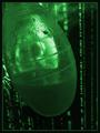
Human Podby CLarson557Comment by moodville: Original and creative. I'm not sure what it is, but I certainly see the connection to the matrix. There seems to have been time and thought put into the image. The placement of the 'pod' is good, and of course the background works. The pod does seem a little blurry, but I think it works within this image. The visualization is what sticks out. The message and the impact comes across just great. |
| Photographer found comment helpful. |
| 05/21/2003 08:11:40 AM |
|
| 05/21/2003 05:47:26 AM |
|
| 05/21/2003 01:05:16 AM |
Human Podby CLarson557Comment by ScottK: Alright, if this is what I think it is, that's just gross. Just had surgery four months ago, and this looks like the drainage tube that collected the puss and fluid out of my incision. Beyond that, there's no real focus (subject wise) and is very blurry. I suppose that could be an "artistic" choice, but it doesn't work for me. |
| Photographer found comment helpful. |
| 05/20/2003 10:58:49 PM |
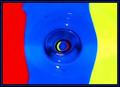
An Eye For Primary Colorsby CLarson557Comment by frisca: Greetings from the Critique Club, Connie!
This is a really neat shot that I hadn't figured out during the challenge, so I really appreciate your comments accompanying the shot.
Colour, Composition, Contrast:
I like the colours a lot on this one, they are bright and saturated. :) My gripe is the way they are strangely blending together at the seams with those weird artifacts. That might be due to the compression, and someone suggested to me that I work on pictures in tiff and then save them as jpeg once done (works even if you took the picture in tiff!) Might also be your computer screen, in which case...still do the tiff trick, it WORKS! :) The arrangement of colours is just perfect.
This is a really neat composition and an interesting abstract. It does look like the colours are going down the drain, and I think that is what really makes this picture pop.
Focus and Lighting:
The focus seems a shade soft, but its not a fatal flaw. The colours are nice and bright and there are no weird shadows, so I'd say well done on all accounts.
Overall:
This is a great idea and an unique picture with great results. Its interesting and bright and at least well deserving of its score and placement! Happy shooting! |
| Photographer found comment helpful. |
| 05/20/2003 07:25:57 PM |
|
| Photographer found comment helpful. |
| 05/20/2003 09:52:06 AM |
|
| 05/20/2003 09:14:03 AM |
|
| Photographer found comment helpful. |
Home -
Challenges -
Community -
League -
Photos -
Cameras -
Lenses -
Learn -
Help -
Terms of Use -
Privacy -
Top ^
DPChallenge, and website content and design, Copyright © 2001-2026 Challenging Technologies, LLC.
All digital photo copyrights belong to the photographers and may not be used without permission.
Current Server Time: 06/11/2026 01:20:29 PM EDT.