| Image |
Comment |
| 01/27/2006 09:35:27 AM |
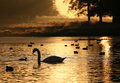
Swan Lakeby AlexSaberiComment by SJCarter: This is stunning... The focus and DOF is really amazing - as are the warm golden tones. My only very slight nit is the slightly tilted water level. I know, it's an awful habit & pet peeve of mine, but I can't help it. LOL I still can't believe how you managed to get the silhouette of the swan and ducks so crisp and the gradual fade of focus and light levels in this shot. Really beautiful. |
 Photographer found comment helpful. Photographer found comment helpful. |
| 01/27/2006 09:31:34 AM |
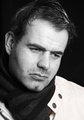
IMG_202dpc.jpgby AlexSaberiComment by SJCarter: I think this would be one of the best ones if it weren't for the seemingly out-of-place catchlights in his eyes and the overly reflective watch. It's a great pose with a lot of emotion (you're REALLY good at capturing that!). I love everything about it except those two things. |
| Photographer found comment helpful. |
| 01/27/2006 09:29:10 AM |
|
| Photographer found comment helpful. |
| 01/27/2006 09:28:55 AM |
IMG_2074dpc.jpgby AlexSaberiComment by SJCarter: Fun shot. Not sure that the crop is the best though - although not sure exactly what to suggest. I would also probably clone out the dark spot between his teeth. Great expression in his eyes and nice smile. |
| Photographer found comment helpful. |
| 01/27/2006 09:27:15 AM |
IMG_1999dpc.jpgby AlexSaberiComment by SJCarter: This is a good shot. I like the composition, and although the lighting is a little harsh on the sweater, it's not overpowering or particularly distracting. The intensity of his expression and the emotion you captured in his eyes is especially good. Nice work. |
| Photographer found comment helpful. |
| 01/27/2006 09:25:26 AM |
IMG_2174dpc.jpgby AlexSaberiComment by SJCarter: I really like this. I think the the reflective pose/expression is great and the lighting is good (although I agree that there are a couple of spots where the glare could be toned down with the heal/blend brush). There are a couple of spots on the scarf that are not desaturated (oversights when desaturating?). Otherwise, terrific job. |
| Photographer found comment helpful. |
| 01/27/2006 09:22:25 AM |
IMG_202dpc.jpgby AlexSaberiComment by downtherabbithole: this is another nice shot. though there is a little more here. the lighting ratio (the difference betwen the brightest bright and the darkist dark) is a little to big, that is it's to dark on the left. use a fill card or a second light to change that. the catch lights in his eyes are in the wrong place, catch lights should always be in the top part of the eye, when you put them in the bottom part it gives it a spooky lighting feel. never ever put a light that is lighting someones face with a light that is level or below the persons face. there are also reflections on the watch, again that is from incorrect lighting. when there is any shiny metal in a shot you have to, have to, use a diffusion screen and pull the light back from the model. if you don't do this you will get what you have here in this shot.
I do like the pose though. other than the hand everything looks great
the hand is distorting the face a little. The hair lighting on the hair does look great and the black and white conversion is beautiful (as always)
overall, I think this is the weakest shot out of the series, but overall the series is great.
p.s. sorry I can't spell anything |
| Photographer found comment helpful. |
| 01/27/2006 09:12:42 AM |
IMG_2174dpc.jpgby AlexSaberiComment by downtherabbithole: this shot is very nice. the light is very balanced and the pose is wonderful. The black and white conversion is great. the only thing I can "rip apart" is very little. the glare on his nose and on his hair are a little distracting. the hair light is suppose to be there but it's a little close, remember hair is reflective. the reflection on his nose could be taken out with the healing brush. other than all of that I would just run them through a double high pass sharpen and print. I'm sure the model loved this image |
| Photographer found comment helpful. |
| 01/27/2006 09:00:59 AM |
IMG_1999dpc.jpgby AlexSaberiComment by Jutilda: Ooh - this one's good too. I like his hair in his face and the way you cropped it. The eyes are really well done in this one. You're good!! |
| Photographer found comment helpful. |
| 01/27/2006 08:58:29 AM |
IMG_2073dpc.jpgby AlexSaberiComment by Jutilda: My favorite on all levels - perfect lighting and the contrast is great. Focus is tack sharp and I like his head cocked. The stripes of his shirt lead the eye right up to his face. If I were to nitpick it, I might say work a bit on that "odd" light that's hitting the top of his ear to the viewer's left side. GREAT shot!! |
| Photographer found comment helpful. |
Home -
Challenges -
Community -
League -
Photos -
Cameras -
Lenses -
Learn -
Help -
Terms of Use -
Privacy -
Top ^
DPChallenge, and website content and design, Copyright © 2001-2026 Challenging Technologies, LLC.
All digital photo copyrights belong to the photographers and may not be used without permission.
Current Server Time: 06/24/2026 08:37:12 AM EDT.