| Image |
Comment |
| 06/01/2005 02:19:27 AM |
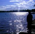
Over the Lakeby LadeeMComment by gruvin: It's always interesting how two people see completely different things in a photo. For that reason, my own observations:
To me, the "overpowering glare" is spectactular. I love it. The inclusion of the three brances provides crucial reference to the upper left vanishing point and resulting perspecitve depth. I'm glad they're there. The silhouette of the person with no detail shown enhances the central subject - the wonderous glare on the water. The "over-exposure" in the clouds adds to a sureal effect making this photo tend toward art and away from a quick snap-shot of nature - yet not so much as to remove the reality of the pure beauty nature displays here.
Well done!
|
 Photographer found comment helpful. Photographer found comment helpful. |
| 05/31/2005 10:34:27 PM |
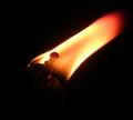
Flameby LadeeMComment by nfessel: This is cool. The composition is well done and the exposure is done well. I like how the flame is trailing out of the frame, to the upper right. Great detail you've capture in the torch as well. This is the best of the three. Here, I am drawn to the actual subject and not to the flaws in the exposure and composition, because there are no flaws. |
| Photographer found comment helpful. |
| 05/31/2005 10:31:27 PM |
Over the Lakeby LadeeMComment by nfessel: Observations: There is no visible detail in the person. It is just a black silhouette. There is a lot of flare from the sun. There are a lot of blown-out highlights in the clouds. The tree branches in the upper right don't add anything to the photo and should have been taken out of the composition. I hope these observations help you when you attempt a similar shot again. Overall, I am drawn away from the subject and pulled more into the flaws in the image exposure and composition. Message edited by author 2005-05-31 22:32:18. |
| Photographer found comment helpful. |
| 05/31/2005 10:19:05 PM |
Over the Lakeby LadeeMComment by twm122: I like this shot. It stood out of the four. I actually like the light and didn't find it all that distracting. I like the "ray" of light. But I am also still pretty new to this. |
| Photographer found comment helpful. |
| 05/31/2005 10:06:11 PM |
Flameby LadeeMComment by SJCarter: Nice clarity of the actual torch in this one and I really like the angles & cropping. Very cool shot. |
| Photographer found comment helpful. |
| 05/31/2005 10:01:53 PM |
Over the Lakeby LadeeMComment by SJCarter: Nice shot. The glare is a little overpowering for my personal tastes, especially when there is also a person in the pic. Have you thought about trying to balance the light with the visibility of the person a little more (i.e., I noticed the light on his shoes as pretty much the first detail about him)? Just a suggestion from someone who's fairly new to the biz... I do like the shot though. |
| Photographer found comment helpful. |
| 05/31/2005 12:35:41 PM |
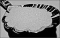
A Spoonful of Sugarby LadeeMComment by sabphoto: would like to have the sugar more white if it is supposed to be regular white sugar. Too gray for my likings. I'm glad you kept from being a close up macro but the sugar lacks detail. Good luck |
| Photographer found comment helpful. |
| 05/30/2005 08:23:50 AM |
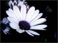
Daisyby LadeeMComment by thatcloudthere: Neat and kind of psychadelic looking. I wish you would have cropped out the blue 'blotch' in the bottom right (or perhaps burned it out). Neat lighting, though. |
| Photographer found comment helpful. |
| 05/29/2005 04:19:58 PM |
A Spoonful of Sugarby LadeeMComment by rscorp: For this particular pic I'm not too crazy for the b&w. The only other thing I see is it seems a bit underexposed, like the sugar should be more white. |
| 05/26/2005 08:02:47 AM |
|
Home -
Challenges -
Community -
League -
Photos -
Cameras -
Lenses -
Learn -
Help -
Terms of Use -
Privacy -
Top ^
DPChallenge, and website content and design, Copyright © 2001-2026 Challenging Technologies, LLC.
All digital photo copyrights belong to the photographers and may not be used without permission.
Current Server Time: 07/16/2026 06:33:59 AM EDT.