| Image |
Comment |
| 03/18/2006 06:36:18 PM |
|
 Photographer found comment helpful. Photographer found comment helpful. |
| 03/17/2006 10:47:11 AM |
|
| Photographer found comment helpful. |
| 03/16/2006 05:33:23 PM |
|
| Photographer found comment helpful. |
| 03/16/2006 03:09:19 PM |
|
| Photographer found comment helpful. |
| 03/15/2006 12:25:56 PM |
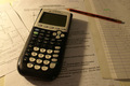
"Modern education"by squeeky jeeComment by Claya: Overall composition is technically OK but point of focus seems too low to me and I'd have liked to see the calculator on. |
| Photographer found comment helpful. |
| 03/15/2006 12:04:27 PM |
|
| Photographer found comment helpful. |
| 03/15/2006 10:13:04 AM |
"Modern education"by squeeky jeeComment by Artifacts: The arrangement and composition of this image is fine.
Lighting and color could be improved. The shadow of the calculator distracts from the image. Adding lighting from the right would mute the distaction, illuminate right side detail and add interest to the image.
White balance is off which gives it a yellow hue that should be corrected in post processing.
You might also consider shifting your central focus point from the center of the calculator to the "5" on the keypad. That would excentuate the effect of your shallow depth of field and minimize the distracting effect of having the near foreground slightly out of focus. |
| Photographer found comment helpful. |
| 03/15/2006 12:19:16 AM |
|
Home -
Challenges -
Community -
League -
Photos -
Cameras -
Lenses -
Learn -
Help -
Terms of Use -
Privacy -
Top ^
DPChallenge, and website content and design, Copyright © 2001-2026 Challenging Technologies, LLC.
All digital photo copyrights belong to the photographers and may not be used without permission.
Current Server Time: 07/15/2026 11:04:59 PM EDT.