| Image |
Comment |
| 08/31/2005 04:39:42 PM |
|
| 08/31/2005 01:12:25 PM |
It's all about the flamesby lissylouComment by TheStick: Great idea and creativity! Minor pointers - couple of hot spots and house reflection in lower right. It might be my monitor but some different lighting might have helped keep the dark shoe from blending into the dark bike, Just IMHO. |
| 08/31/2005 12:18:05 PM |
|
| 08/31/2005 07:17:15 AM |
|
| 08/30/2005 08:59:14 PM |
me2.jpgby lissylouComment by SJCarter: Great portrait, but as several have said already, I think you should lose the cord. That being said, I also think you could crop off a significant portion of the right-hand side of the image, so that your back closely parallels the edge of the frame. You have great posture and the image is quite able to stand on its own merits (so to speak). My personal take (albeit, that brings a whole discussion thread into the comment - LOL), is that you could bring down the overall lighting a tad to help improve contrast and bring out some of the richer, deeper tones & detail. Still, a very strong shot. |
 Photographer found comment helpful. Photographer found comment helpful. |
| 08/30/2005 08:42:08 PM |
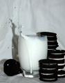
Spillby lissylouComment by SJCarter: Very cool idea. I think it lost something in the translation though. I'm not trying to be harsh, just honest. I love the idea of what I think you were trying to create based on the title, but the "ghost" images don't have enough of the tumble out of the box to make it realistic (if you know what I mean). They've got lots of "spill" but not enough of the transition from box to floor to make it plausible for the visually-oriented mind. I think you've got a great point of reference and starting point (good contrast, lighting, & color), but if you have some additional shots from this experiment, you might look for a version that contains more of this transition. Hope I'm making sense. |
| Photographer found comment helpful. |
| 08/30/2005 06:51:43 PM |
|
| Photographer found comment helpful. |
| 08/30/2005 03:40:32 PM |
|
| Photographer found comment helpful. |
| 08/30/2005 02:32:11 PM |
The Dunkby lissylouComment by fplouffe: You have too much shadow in this image. The use of multiple light source (and diffusing them) would have help. Try bouncing the light on a white cardboard instead of pointing it directly at your subject. |
| Photographer found comment helpful. |
| 08/30/2005 01:43:10 AM |
The Dunkby lissylouComment by photobug5050: Nice shot, but maybe a different color for the background would have been more effective. It really would have made the splash stand out more. |
| Photographer found comment helpful. |
Home -
Challenges -
Community -
League -
Photos -
Cameras -
Lenses -
Learn -
Help -
Terms of Use -
Privacy -
Top ^
DPChallenge, and website content and design, Copyright © 2001-2026 Challenging Technologies, LLC.
All digital photo copyrights belong to the photographers and may not be used without permission.
Current Server Time: 07/16/2026 03:28:34 PM EDT.