| Image |
Comment |
| 12/26/2005 08:40:55 AM |
|
 Photographer found comment helpful. Photographer found comment helpful. |
| 12/26/2005 07:59:19 AM |
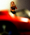
Tuckersmomby Man_Called_HorseComment by L1: I'm not sure I understand the message presented. The photo itself, IMHO, is cluttered with a lot of info that is either extraneous or confusing. The red out-of-focus element in the foreground is more of a distraction than anything (is it a shoe?) and the hot spots on that same element really pull the eye away from the figure, which is what I assume is the main subject. The image is not evenly-lit, which is a bit distracting as well, especially in the background. The blown-out area on the left contrasts a bit too heavily with the darker area on the right. The texture on the wall is a bit of a distracting element as well. If you could seperate the subject from the background more, it would be smoother and more pleasing to the eye. Please take my critique with a grain of salt, because I am no pro. I just wanted to offer my immediate thoughts. |
| 12/26/2005 03:00:38 AM |
|
| Photographer found comment helpful. |
| 12/26/2005 01:00:06 AM |
|
| Photographer found comment helpful. |
| 12/26/2005 12:51:40 AM |
|
| Photographer found comment helpful. |
| 12/26/2005 12:39:23 AM |
|
| Photographer found comment helpful. |
| 12/24/2005 04:31:26 AM |
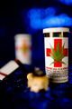
Meds v3by Man_Called_HorseComment by mycelium: wow, I've never seen a medical marijuana bottle label before... how cute...
I just figured out that the yellowish glob is the bowl of a pipe. If the bowl were in the focal plane, this would be much stronger.
the focal plane should probably also have been a bit closer to the camera, about on the "U" in "MEDICAL USE ONLY." Remember, the range of acceptable DOF around the actual point of focus is 1/3 coming toward the camera and 2/3 going away - so keep the focus somewhat closer than in the middle of the area that needs to be sharp. |
| Photographer found comment helpful. |
| 12/23/2005 02:47:22 PM |
Meds v3by Man_Called_HorseComment by DelRioPhoto: Well, this is an interesting one. Good DOF, but I would have liked it better if the label on te bottle was a little more in focus. |
| Photographer found comment helpful. |
| 12/22/2005 04:02:48 PM |
Meds v3by Man_Called_HorseComment by GrayGhost: Nice colors, and reasonable composition, except the pipe(?) is distracting, would be better further back and in focus with the vial. |
| Photographer found comment helpful. |
| 12/22/2005 03:30:18 PM |
|
| Photographer found comment helpful. |
Home -
Challenges -
Community -
League -
Photos -
Cameras -
Lenses -
Learn -
Help -
Terms of Use -
Privacy -
Top ^
DPChallenge, and website content and design, Copyright © 2001-2026 Challenging Technologies, LLC.
All digital photo copyrights belong to the photographers and may not be used without permission.
Current Server Time: 07/18/2026 06:01:55 PM EDT.