DPChallenge: A Digital Photography Contest You are not logged in. (log in or register
 
Browse Settings
Currently viewing:
Registered Userjimmyn4

Show comments:

Per page:

Order:

Comments:


Comments Received by jimmyn4
Pages:   ... ... [53]
Showing 371 - 380 of ~524
Image Comment
texture
02/25/2003 09:47:11 PM
texture
by jimmyn4

Comment by muckpond:
CRITIQUE CLUB!

Overall, an excellent photo that meets the challenge quite well.

What I like:
The color and lighting are both quite enjoyable. I like the pointed light from the right and the resulting shadows on the left -- I think it really brings the texture out more.

What I don't like:
Since it's obvious that the texture of the sponge was your secondary goal (your primary being the yellow color), I thing that the photo might have been better if it had been simpler. While I'm a huge fan of DOF, the fuzzy foreground and background both somewhat detract from the sharp center portion of the sponge. Just an idea, but in this case the DOF interferes with the texture.

Also, I would have tried to crop out that yellow blotch in the lower left corner...it does stand out.

Well done.
Rob
Photographer found comment helpful.
...isn't free.
02/25/2003 12:08:44 PM
...isn't free.
by jimmyn4

Comment by emorgan49:
Hello from the Critique Club -

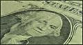
My favorite comment on this picture is "don't see love". Yep, that was the message, and he got it. Love isn't Free. Money can't buy (me) love. There's more to life than money. Old George has the answer.

This is a really nice macro. First because it is technically fine and second because the composition is interesting, So, you got the focus right, and the lighting right. Color balance is right too.

It's a trick to take something so familiar to most of us and turn it into an interesting picture. A dollar bill, big deal. I like that this is a used dollar. The fold down the middle which you have placed exactly on the diagonal makes a balancing line for the stronger horizontals near the top (X is always an interesting arrangement) and the semi circle around George. George is dead center, at least his eyes are but you create an optical illusion so that he doesn't appear to be in the middle. I like that one of his eyes is sharp and looks right at the viewer and the other is faded. That worn fold is also used as a texture contrast with the dotted and thumbprint patterns on the paper. Even though it was not your decision, the duotone green and black is nice.

I don't have any suggestions for improvement - You took a simple image with a thematic punch and made all the right design choices. 1. you eliminated any extraneous background. 2 you chose a worn out bill, 3. you put it on the diagonal, 4. you put george in the middle with his eyes on the opposite diagonal so he appears to be making eye contact with the viewer. 5 you included just enough lettering to be interesting without being distracting. people need to be able to read letters but if there is too much to read it dominates. 6 you used the circle effectivley. 7. I like your Macro lens.

Disclaimer: Remember that this is just my opinion and I am NOT an expert.

PS - I like some of your othe pictures too - the uniform, the barbeque, the keyhole. Nice work

Message edited by author 2003-02-25 17:24:06.
Photographer found comment helpful.
texture
02/23/2003 04:47:06 AM
texture
by jimmyn4

Comment by aussie:
Excellent macro shot of texture. The colour is awesome as well as the clarity and dof. Beautiful lighting technique too. Well done and GL.
Photographer found comment helpful.
texture
02/22/2003 03:49:34 PM
texture
by jimmyn4

Comment by Crafty Sue:
I like the texture
Photographer found comment helpful.
texture
02/22/2003 01:27:37 PM
texture
by jimmyn4

Comment by JPR:
Very nice texture. i would like to know what it is. Honeycomb?
Photographer found comment helpful.
texture
02/22/2003 06:26:04 AM
texture
by jimmyn4

Comment by Konador:
Nice.... texture! I like the little bit of black in the top right, it helps add some good contrast to the photo.
Photographer found comment helpful.
texture
02/21/2003 05:32:53 PM
texture
by jimmyn4

Comment by bod:
I nearly submitted a macro of a sponge that looked quite similar to this, so yeah I like it!
Having seperate parts of whatever it is works really well and breaks the light up nicely. Good job with the focus & DoF too. Well done.
Photographer found comment helpful.
texture
02/21/2003 03:22:15 AM
texture
by jimmyn4

Comment by MattW:
Nice value
Photographer found comment helpful.
Stairwell
02/19/2003 06:45:29 PM
Stairwell
by jimmyn4

Comment by indigo997:
HI! It looks like you live in a nicely restored old building. I love places like that.

Composition: The wood railing and ironwork is really cool. The stairs themselves just aren't too interesting. I don't know how you would isolate the rail and iron more though ... what happens if you shoot up from that lower landing? Is there some way to compose it against a solid wall or ceiling? I think I'd rather see it more as an architectural detail shot - rather abstract - than a stairwell shot. I sort of like the window in that it matches the railing, but it puts a little too much interest in that top part of the shot.

Lighting is good. The shellac on the end of the railing is obviously very shiny ... You can hold up some sort of paper or diffusing material to block direct light on problem areas like that.

Focus: I guess you tried to use a shallow dof to emphasize the perspective, but I'm not sure it works with this shot. There just isn't enough difference between the near and far. I'd rather see it all in focus or the front in focus and the back blurred a lot more than it is.

Yes, this shot fits the challenge. Technically, it has a few glitches but nothing major. I think the biggest problem was just composition and subject. If the wood and ironwork is what drew you to this subject then that is what you should try to really show in the shot. Having the stairs and window just makes it a little too cluttered IMO. There are too many lines going too many different directions.

Your score was decent though, and it's obvious that you are keeping your eyes open. Good luck in the future challenges.
Photographer found comment helpful.
texture
02/18/2003 11:24:58 AM
texture
by jimmyn4

Comment by KimInNB:
Great texture - wonderful macro. What is this? A scrubby? 8
Photographer found comment helpful.
Pages:   ... ... [53]
Showing 371 - 380 of ~524


Home - Challenges - Community - League - Photos - Cameras - Lenses - Learn - Help - Terms of Use - Privacy - Top ^
DPChallenge, and website content and design, Copyright © 2001-2025 Challenging Technologies, LLC.
All digital photo copyrights belong to the photographers and may not be used without permission.
Current Server Time: 08/04/2025 06:12:12 PM EDT.