| Image |
Comment |
| 12/02/2002 12:32:00 AM |
|
| 09/28/2002 10:46:00 PM |
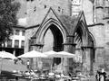
My coffee place!by victor01Comment by alanfreed: Pretty cool! I may have been tempted to leave out the other building and the motorcycle, while focusing in more on the tables/main building. Perhaps standing a few steps to the left could have accomplished that...? |
| 09/28/2002 08:12:00 PM |
My coffee place!by victor01Comment by sohr: That's quite a coffee place! The black and white doesn't really work for me here-- probably because it masks a lot of the detail to be found in the beautiful old buiilding. --5-- sohr |
| 09/26/2002 05:59:00 PM |
|
| 09/26/2002 05:03:00 PM |
|
| 09/25/2002 09:47:00 PM |
|
| 09/25/2002 05:30:00 PM |
|
| 09/25/2002 04:39:00 PM |
|
| 09/24/2002 11:42:00 PM |
My coffee place!by victor01Comment by paganini: Is that tree on the left really necessary to be in this composition? I find the building interesting, especially the one with the two openings. I also think that a vertical compositio nworks better -- move 3-4 steps to the right, making the building a bit symmetrical, go vertical on your camera, move a bit closer so that the seats, table, shade be a main interesting and let the contrast between the white umbrella and the nice texture of the building do the talking. The tree and the open space on the left is just too distracting, for me. 6 paganini |
| 09/24/2002 03:45:00 PM |
My coffee place!by victor01Comment by cq107: I dont think B&W works well.. It would be more interesting to see the old building contrasted with the new chairs/building in color... |
Home -
Challenges -
Community -
League -
Photos -
Cameras -
Lenses -
Learn -
Help -
Terms of Use -
Privacy -
Top ^
DPChallenge, and website content and design, Copyright © 2001-2026 Challenging Technologies, LLC.
All digital photo copyrights belong to the photographers and may not be used without permission.
Current Server Time: 07/16/2026 12:49:45 AM EDT.