| Image |
Comment |
| 09/17/2008 10:37:55 AM |
Friendsby BrinComment by Brin: Originally posted by dikois:
Hi Brin,
What do you use to cut out the background...that's definitely not the extract tool in PS....are you using Fluid Mask?
Cheers |
Hi Jeremy
I did not cut the background out in this image, the sky was very gray (nearly white) when I took it and in the post processing I used curves to make it completely white like this. Thanks! Message edited by author 2008-09-17 10:38:15. |
| 09/17/2008 10:32:08 AM |
Overby BrinComment by Brin: Originally posted by ambaker:
Critique Club Review:
Brightness and Contrast: Image is mildly over exposed, which is part of the challenge. I think perhaps it could be taken up a bit more with an increase in the contrast. I'd like to see the rocks a little lighter, a little brighter, but would still want the figure dark the way it is now.
Focus and depth of field: Focus is nice and sharp. Depth of field is great.
There is really not much more you can do with this image. What makes the image is all the detail in the rocks, and the sky. If you brightened all that much more, the detail would be lost, and the final result would be less than you have now.
I see what looks like a small island beyond the subject. Perhaps that against a bright sea and bright sky, would have worked better for an overexposed challenge.
This is an excellent image, just one that has a harder time carrying the theme of the challenge. |
Many thanks Alex for your good critique - much appreciated. |
| 09/17/2008 04:10:40 AM |
Friendsby BrinComment by dikois: Hi Brin,
What do you use to cut out the background...that's definitely not the extract tool in PS....are you using Fluid Mask?
Cheers |
 Photographer found comment helpful. Photographer found comment helpful. |
| 09/16/2008 01:45:02 PM |
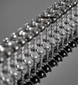
Only Oneby BrinComment by DLPhoto: This is pure eye candy, for sure! Strong composition, DOF control and where on earth did you find so many identical chalices??? LOL Great job :) |
| Photographer found comment helpful. |
| 09/15/2008 10:47:50 PM |
Overby BrinComment by ambaker: Critique Club Review:
Brightness and Contrast: Image is mildly over exposed, which is part of the challenge. I think perhaps it could be taken up a bit more with an increase in the contrast. I'd like to see the rocks a little lighter, a little brighter, but would still want the figure dark the way it is now.
Focus and depth of field: Focus is nice and sharp. Depth of field is great.
There is really not much more you can do with this image. What makes the image is all the detail in the rocks, and the sky. If you brightened all that much more, the detail would be lost, and the final result would be less than you have now.
I see what looks like a small island beyond the subject. Perhaps that against a bright sea and bright sky, would have worked better for an overexposed challenge.
This is an excellent image, just one that has a harder time carrying the theme of the challenge. |
| Photographer found comment helpful. |
| 09/13/2008 08:52:18 AM |
|
| 09/12/2008 11:21:42 PM |
|
| Photographer found comment helpful. |
| 09/12/2008 12:55:16 PM |
Only Oneby BrinComment by ordinaryangel: The setup here is great. I really like the tones that come out in the b&w conversion, too. I think the shallow DOF works very well here to create an engaging image. Nice work. |
| Photographer found comment helpful. |
| 09/11/2008 06:33:52 AM |
Only Oneby BrinComment by andrewt: Concept is great , but the overall image has become too complicated, 6 |
| Photographer found comment helpful. |
| 09/10/2008 09:36:25 PM |
Only Oneby BrinComment by renegrub: If only the one filled were in focus (the one behind and in front of it distract you). |
Home -
Challenges -
Community -
League -
Photos -
Cameras -
Lenses -
Learn -
Help -
Terms of Use -
Privacy -
Top ^
DPChallenge, and website content and design, Copyright © 2001-2026 Challenging Technologies, LLC.
All digital photo copyrights belong to the photographers and may not be used without permission.
Current Server Time: 06/20/2026 11:54:21 AM EDT.