| Image |
Comment |
| 06/08/2005 01:30:04 AM |
Replacementby virtuamikeComment by rainingsunshine: The middle light is a little harsh on my eyes, but it goes nicely with the picture. Almost like I'm there and I need to squint from the light :P |
 Photographer found comment helpful. Photographer found comment helpful. |
| 05/17/2005 07:52:48 PM |
|
| Photographer found comment helpful. |
| 05/17/2005 01:31:17 AM |
|
| Photographer found comment helpful. |
| 05/08/2005 09:19:15 AM |
|
| Photographer found comment helpful. |
| 05/03/2005 08:38:31 PM |
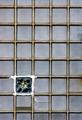
1 / 35by virtuamikeComment by metoecus: I can't quite make out what the pattern on the contrasting brick is, but I like the composition. There are discolorations on some of the bricks, but in this case it complements the feel of the rest of the image. |
| Photographer found comment helpful. |
| 05/03/2005 08:16:28 PM |
|
| Photographer found comment helpful. |
| 05/02/2005 12:22:34 PM |
|
| Photographer found comment helpful. |
| 05/02/2005 12:21:54 PM |
1 / 35by virtuamikeComment by beckettboots: I really like this one - the statement of repetition and then a different element is definitely minimalist. Did you explore different ratio formats? Just a thought that maybe a perfect square to echo the squares of the glass blocks might lend more to the minimalist vibe. 7 |
| Photographer found comment helpful. |
| 05/02/2005 09:03:13 AM |
|
| Photographer found comment helpful. |
| 04/30/2005 10:29:07 PM |
1 / 35by virtuamikeComment by Joey Lawrence: Very interesting, however it is a bit hard to make out the design in the square because it is too far away |
| Photographer found comment helpful. |
Home -
Challenges -
Community -
League -
Photos -
Cameras -
Lenses -
Learn -
Help -
Terms of Use -
Privacy -
Top ^
DPChallenge, and website content and design, Copyright © 2001-2026 Challenging Technologies, LLC.
All digital photo copyrights belong to the photographers and may not be used without permission.
Current Server Time: 06/21/2026 03:56:04 AM EDT.