|
|
| Image |
Comment |
| 12/05/2005 09:33:38 AM | |  Photographer found comment helpful. Photographer found comment helpful. |
| 12/02/2005 05:13:55 PM | | | Photographer found comment helpful. |
| 09/27/2005 11:48:15 PM | | | Photographer found comment helpful. |
| 09/26/2005 12:00:07 PM | | | Photographer found comment helpful. |
| 09/24/2005 05:39:07 PM | | | Photographer found comment helpful. |
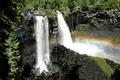
| 09/23/2005 04:10:50 PM | Where's Ron?by Photogirl_in_VancouverComment by Chiqui: Greetings from the Critique Club.
The first thing that caught my eye in this picture was the waterfalls and then the rainbow. Nice capture. There's a few things that I think think would have made this image better. First, there is no real sense of perspective here, it's just not very obvious. The blurring of the water works wonderfully with waterfalls but here the highlights are too blown. Perhaps a shorter shutter speed would have worked better. The colors look muted, a little bit of saturation would make this a much more appealing photo. This image has to potential, it just has to be tweaked a little.
If you have any questions or comments about this critique, please feel free to PM me.
June |
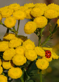
| 09/23/2005 08:11:11 AM | Baby's first Portraitby Photogirl_in_VancouverComment by zapgrafx: Greetings from the Critique Club,
This is going to be a difficult picture to critique I scored this portrait an 8. This is an absolutely precious moment and a beautiful capture.
Some people might argue that your image might have been stronger using the rules of thirds but I would disagree this is one of those images that is more powerful in my opinion by breaking that rule.
Technically there is nothing to say about this image you did everything dead on right.
The only 2 things I deducted points for where composition and very minor:
1. the border, my dad taught me to KIS Keep it Simple let your work speak for itself. I was suprised not to see this image in the top 20. It is very strong but the border does subtract a bit as the image is so delicate and the border is so harsh.
2. the upper right corner of the image instead of a black fill I think it might be a stronger image with a light color.
But again, this is an excellent image those things are minor - after reviewing your portfolio your challenge entries keep getting stronger with each - I see a ribbon in your future! :) I hope this helps in some small way, best regards. Michele
| | Photographer found comment helpful. |
| 09/22/2005 12:57:41 AM | | | Photographer found comment helpful. |
| 09/22/2005 12:18:44 AM | | | Photographer found comment helpful. |
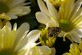
| 09/21/2005 09:39:05 PM | One, Two, Three, I see a beeby Photogirl_in_VancouverComment by macrothing: 5 - Good potential, nice colors. Criticism; while it seems you have met the Challenge with the 'rule' (but I am not 'expert'), I would like to see a more precise 'placement' using the rule. Also, the focal point needs to be 'higher', as the 'bottom' of the bee, and the flower under it and left have the focus. This does not look 'natural' to me, (if it is my apologies), but the bee looks dead, and placed - if so, then a better 'positioning' and angle would have made this a better shot in my opinion. The soft lighting coupled with the 'yellows' and 'creams' is nice, but the darkness underneath detracts in my opinion to the 'feel' of this shot. Mainly the focal point(s) for me need addressing here, and that 'dark gap'. Up to 5 from 4 for potential. | | Photographer found comment helpful. |
Home -
Challenges -
Community -
League -
Photos -
Cameras -
Lenses -
Learn -
Help -
Terms of Use -
Privacy -
Top ^
DPChallenge, and website content and design, Copyright © 2001-2026 Challenging Technologies, LLC.
All digital photo copyrights belong to the photographers and may not be used without permission.
Current Server Time: 07/15/2026 02:22:38 PM EDT.
|