| Image |
Comment |
| 12/31/2006 07:32:33 PM |
Special K Rust Patternby hotpastaComment by Tammer: I like the colors in your image. My eyes however keep getting drawn to the left hand side of your photo - where the vertical "white line" is. For me, this detracts overall. |
 Photographer found comment helpful. Photographer found comment helpful. |
| 12/31/2006 07:04:42 PM |
|
| Photographer found comment helpful. |
| 12/31/2006 02:47:50 PM |
|
| Photographer found comment helpful. |
| 12/31/2006 11:38:19 AM |
|
| Photographer found comment helpful. |
| 12/31/2006 08:43:43 AM |
|
| Photographer found comment helpful. |
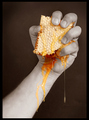
| 12/30/2006 06:48:26 PM |
Sticky Fingersby hotpastaComment by ericwoo: Hey there from the Critique Club
Camera Work/Technical: Great focus and terrific post-processing. The arm looks a little discolored and blurry, providing a mild distraction that attracts the eye.
Lighting: All of your elements are very nicely and evenly lit.
Composition/Content: Terrific composition. The angle of the arm provides a great line to lead the eye up and into the image, and up to the subject of the image. I don't personally like the uneven, black framing. It looks more accidental than designed, but I rarely hold points for borders. I would not have held points for this one, but it really didn't add to the quality either.
My Opinion: Looking through the challenge results, this one is far better than MANY that finished ahead of it. I think that the odd tone on the skin may have contributed to the lower than expected score, but who am I to think I have voters figured out?
Eric
|
| Photographer found comment helpful. |
| 12/30/2006 06:05:41 PM |
|
| Photographer found comment helpful. |
| 12/30/2006 02:38:28 PM |
|
| Photographer found comment helpful. |
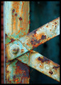
| 12/30/2006 01:53:57 PM |
Special K Rust Patternby hotpastaComment by Kavey: K for Kavey! I love the wonderful colours and textures of rusting surfaces and this example is just wonderful. Great choice of detail to create strong composition and interest too. |
| Photographer found comment helpful. |
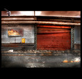
| 12/30/2006 12:14:29 PM |
Delapidatedby hotpastaComment by h2: had preferred not to include the seagull. OOF area at left distracts a bit |
| Photographer found comment helpful. |
Home -
Challenges -
Community -
League -
Photos -
Cameras -
Lenses -
Learn -
Help -
Terms of Use -
Privacy -
Top ^
DPChallenge, and website content and design, Copyright © 2001-2026 Challenging Technologies, LLC.
All digital photo copyrights belong to the photographers and may not be used without permission.
Current Server Time: 07/27/2026 12:23:43 PM EDT.


![hotpreacher: [this little light of mine...]](https://images.dpchallenge.com/images_challenge/0-999/604/120/Copyrighted_Image_Reuse_Prohibited_441398.jpg)