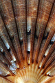
Sunriseby
photogenixComment by kari1: ::: Critique Club :::
Hi, I am Kari and am fairly new to the critique club.
What a lovely picture you chose for the patterns challenge, something new to try with shells.
Great to do a critique on your image but it is difficult if you don't give us any information in your photographers comments. When we do a critique, we go past just the photographic result, that's what voters comments do. The critique looks at what you were trying to achieve, how you wanted it to look and what issues you had in getting the image captured and ready for voting.
First Impression - the most important one:
This is a good picture, it creates interest, but doesn't quite hold it for long.
Composition:
I wonder two things:
Would a slightly wider crop have worked better. Increasing the width of the subject and expanding to incorporate more of the "rays" reaching out.
It is also very centred ... would it have worked with the sunrise coming from the vertical third?
Is the picture slightly oversharpened. There is a lot of grain showing on the shell .. is this due to the level of sharpening used .. it may not be oversharpened, but is a thought - mind you then it may be too soft ... but the sunrise is a soft thing quite often.
Subject:
Excellent choice of subject matter and great use of shell to convey your image.
Technical (Colour and light):
I think that the colouring is nice and deep .. and that the lighting you have use works well for what I think you are aiming for.
To grow its vote?:
It is a well above average shot, I think looking at the crop may have helped in growing the score, just to create a wider appeal to people.
Summary:
Good concept and well executed. The picture itself is nicely balanced and well shot.
If you've got any questions about this critique, please feel free to contact me via the PM system.
Cheers
Kari