| Image |
Comment |
| 10/14/2005 04:33:26 PM |
|
 Photographer found comment helpful. Photographer found comment helpful. |
| 10/14/2005 12:19:44 AM |
|
| Photographer found comment helpful. |
| 10/13/2005 08:43:42 PM |
|
| Photographer found comment helpful. |
| 10/12/2005 11:47:22 AM |
|
| Photographer found comment helpful. |
| 10/12/2005 10:29:23 AM |
|
| Photographer found comment helpful. |
| 10/12/2005 09:04:54 AM |
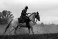
Commitment to the Confederacyby popdeepopComment by glad2badad: Overall I like the feel of this image. B/W was a good choice. It's a shame about the powerlines. ;^( Wonder how this might have looked in a full silhouette? The rider is already pretty dark. Just a thought. Good luck in the challenge. |
| Photographer found comment helpful. |
| 10/12/2005 04:59:33 AM |
|
| Photographer found comment helpful. |
| 10/12/2005 12:29:44 AM |
|
| Photographer found comment helpful. |
| 10/11/2005 12:16:18 AM |
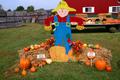
At The Orchardby popdeepopComment by stek: I think if you cut out part of the background it would have been a better picture. Love the pumpkins and their colors. |
| Photographer found comment helpful. |
| 10/08/2005 02:45:56 PM |
At The Orchardby popdeepopComment by HVGB_photos: Complementary colours are pairs of opposite colours that contrast strongly when compared to each other. The challenge called for two complementary colors to compose your photograph but in your photo I see a range of reds, oranges, yellows, greens and blues that give a brilliant effect of colour, but not the effect of tones of a single predominating colour against tones of its opposite or complementary colour.
I think your submission would have been a stronger demonstration of complementary colours if you had chosen a subject with two main colours that are complementary to each other. For example, perhaps you could have cropped the subject to show the scarecrow's blue pants with orange pumpkins in front, or if you had shown green vegetables against the red barn, or the bales of hay with some brighter yellow produce against the sky.
|
| Photographer found comment helpful. |
Home -
Challenges -
Community -
League -
Photos -
Cameras -
Lenses -
Learn -
Help -
Terms of Use -
Privacy -
Top ^
DPChallenge, and website content and design, Copyright © 2001-2026 Challenging Technologies, LLC.
All digital photo copyrights belong to the photographers and may not be used without permission.
Current Server Time: 06/17/2026 02:34:18 PM EDT.