| Image |
Comment |
| 04/19/2005 07:38:55 AM |
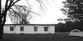
Camp Turleyby LesleyNelsonComment by Brad: Though meeting the challenge, there isn't a lot to really capture a viewr's attention here. The focal point shifts back & forth between the dome structure to the main building, fighting for attention (distracting). |
 Photographer found comment helpful. Photographer found comment helpful. |
| 04/19/2005 01:02:30 AM |
|
| Photographer found comment helpful. |
| 04/18/2005 07:46:42 PM |
|
| Photographer found comment helpful. |
| 04/18/2005 05:49:04 PM |
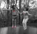
Kidsby LesleyNelsonComment by RKT: The "selective" red is a bit distracting.. would have been much better without it. The sheen of the trampoline surface is super nice. |
| Photographer found comment helpful. |
| 04/18/2005 05:11:48 PM |
|
| Photographer found comment helpful. |
| 04/18/2005 11:03:31 AM |
Kidsby LesleyNelsonComment by TDCollins: There are places where selective desaturation works, and places where it doesn't. The picture would do a lot better if the girls were not desaturated. 5 |
| Photographer found comment helpful. |
| 04/18/2005 08:01:25 AM |
Kidsby LesleyNelsonComment by ahaze: While selective desat is fun to play with, it's also pretty unnecessary and detracts from this photo. I feel like this youthful activity needs all it's color. |
| Photographer found comment helpful. |
| 04/18/2005 12:48:59 AM |
Kidsby LesleyNelsonComment by md8speed: Good shot, but I think you should have make it totally b/w and left out the red. |
| Photographer found comment helpful. |
| 04/18/2005 12:36:20 AM |
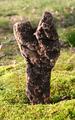
"Y"by LesleyNelsonComment by HBunch: *Critique Club*
Wow, very odd that I would get 2 of your photos one right after the other.
Anyway, the lighting on this seems awefully harsh. There are hot spots on the rock to the left of the photo, and the grass seems too bright as well. You could experiment with different times of the day, or maybe find a way to block some of the bright sunlight without making the shot too dark.
I think focus and clarity are excellent in this shot. The DOF really helps to get background elements blurred and 'out of the way'. The thing I don't like though about the background, is that there seems to be a 'seperation' of 2 types of grassy areas. There is a longer grassy area in the way back and a shorter grassy area in the front. This seperation line is just about right in the middle of your photo. I think that maybe it would have a higher visual appeal had the seperation line been lower in the photo. I hope I explained that ok, kind of hard to explain without pointing to the photo and saying 'right here'. lol
This shot isn't really exciting to me. It's not drawing me in. It is definately in interesting rock, but just not something I care to look at for long periods of time.
The Y is very obvious and fits the challenge well in my opinion. Overall, an interesting shot that could benefit from different lighting, but not a photo I'd hang on my wall. ~Heather~ |
| Photographer found comment helpful. |
| 04/18/2005 12:21:38 AM |
|
| Photographer found comment helpful. |
Home -
Challenges -
Community -
League -
Photos -
Cameras -
Lenses -
Learn -
Help -
Terms of Use -
Privacy -
Top ^
DPChallenge, and website content and design, Copyright © 2001-2026 Challenging Technologies, LLC.
All digital photo copyrights belong to the photographers and may not be used without permission.
Current Server Time: 07/16/2026 05:53:48 PM EDT.