| Image |
Comment |
| 11/02/2006 10:18:42 AM |
Chicby loveComment by Cutter: whoa. this is right up my alley. you directed the placement of eyes and "look away" masterfully. |
 Photographer found comment helpful. Photographer found comment helpful. |
| 11/01/2006 11:44:04 PM |
Chicby loveComment by gaurawa: I like it. very simple and very well done. I like the expression a lot |
| Photographer found comment helpful. |
| 11/01/2006 10:26:53 PM |
Chicby loveComment by posthumous: Damn. You've got the touch. Fashion is art in this photo. Starting at 8 |
| Photographer found comment helpful. |
| 11/01/2006 08:43:37 PM |
Red Hatby loveComment by alfresco: Nothing like girl hats, maybe that's why I like My Fair Lady ... I like and the b/w - they're very nice!. I really like the contrast of the red to the bg, and the lighting/shadow of the bg really brings the eye to the model.
I always look forward to your photos - you're pretty darned good. |
| Photographer found comment helpful. |
| 11/01/2006 06:08:05 PM |
Blue Shoesby loveComment by love: Thanks Judi.. please don't judge me by this image.. was definitely not my forte and I now know that I should stick to what I do best.. women : ) |
| 11/01/2006 10:11:27 AM |
Chicby loveComment by Jutilda: Nice high contrast. I might have more negative space to one side. She's lovely. |
| Photographer found comment helpful. |
| 11/01/2006 07:40:16 AM |
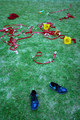
Blue Shoesby loveComment by Judi: Oh that is where my shoes went. Welcome to the team and WPL Chispa. |
| Photographer found comment helpful. |
| 11/01/2006 05:45:43 AM |
|
| Photographer found comment helpful. |
| 10/27/2006 09:10:01 PM |
Blue Shoesby loveComment by L1: It took more than a few moments to figure out what all the burgundy things were in the back of the image. Voters typically only give images a cursory glance of a few seconds, and if it takes longer than that to "get" an image, you stand a good chance of receiving a bad score. The concept of this shot is good, but its execution is lacking. The image has a blue cast to it, making the colors a bit unrealistic on my monitor. The composition of the image is very scattered and lacking a focal point when you take away the title. I think that changing the perspective, i.e. squatting down instead of taking the shot from eye level, might have increased the power of the image. Good luck in the challenge. |
| Photographer found comment helpful. |
| 10/27/2006 11:35:28 AM |
|
| Photographer found comment helpful. |
Home -
Challenges -
Community -
League -
Photos -
Cameras -
Lenses -
Learn -
Help -
Terms of Use -
Privacy -
Top ^
DPChallenge, and website content and design, Copyright © 2001-2026 Challenging Technologies, LLC.
All digital photo copyrights belong to the photographers and may not be used without permission.
Current Server Time: 06/25/2026 07:09:17 AM EDT.