| Image |
Comment |
| 08/14/2007 02:02:44 AM |
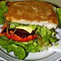
Eat in or Take Awayby BrianRComment by Shadowi6: alas this is just a close up of a burger, the lighting whilst ok is rather flat and unintresting, the bg suggests that its on the carpet? |
 Photographer found comment helpful. Photographer found comment helpful. |
| 08/13/2007 10:09:33 PM |
|
| Photographer found comment helpful. |
| 08/13/2007 04:03:40 PM |
|
| Photographer found comment helpful. |
| 08/13/2007 02:28:08 PM |
Eat in or Take Awayby BrianRComment by glad2badad: Lighting could use a little work. Seems a bit harsh. Maybe add some side lighting? Use a reflector? Diffuse a little? Just my observations. Good luck. |
| Photographer found comment helpful. |
| 08/13/2007 12:41:26 PM |
|
| Photographer found comment helpful. |
| 08/13/2007 12:17:45 PM |
Eat in or Take Awayby BrianRComment by Tammer: For me, the flash seems a bit harsh, perhaps natrual lighting would work better? There's also a lot of green and not much of the meat showing. |
| Photographer found comment helpful. |
| 08/13/2007 08:38:56 AM |
|
| Photographer found comment helpful. |
| 08/08/2007 09:29:53 PM |
|
| Photographer found comment helpful. |
| 08/07/2007 05:42:59 PM |
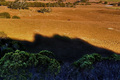
The Laughing Fishermanby BrianRComment by see: And thats the diffrence with the enough lighting, natural or otherwise. I voted this a 6, it would have been a easy 8 or more with better lighting in the front. I would lay odds .5 to 1 in overall score improvement. |
| Photographer found comment helpful. |
| 08/06/2007 11:27:19 PM |
Blossomsby BrianRComment by levyj413: I like the arrangement a lot, and the background adds interest. I would like it better with something on the left, but if you intended that gap to add tension, it's working. :)
The lighting is pretty flat. A light to the right, for instance, could've added shadows to fill the gap on the left.
It also seems pretty low in contrast. I'd try bumping it up using levels, curves, or even just brightness/contrast. Highlight the wonderful variety of tones in the bricks.
Finally, I'd like to see more detail on the statue. It's so dark on my calibrated CRT that there are lots of areas that are pure black. |
Home -
Challenges -
Community -
League -
Photos -
Cameras -
Lenses -
Learn -
Help -
Terms of Use -
Privacy -
Top ^
DPChallenge, and website content and design, Copyright © 2001-2026 Challenging Technologies, LLC.
All digital photo copyrights belong to the photographers and may not be used without permission.
Current Server Time: 05/20/2026 09:33:18 PM EDT.