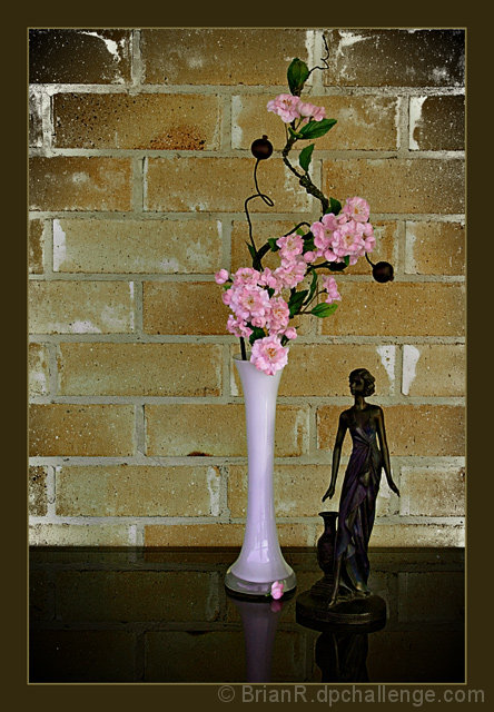
I like the arrangement a lot, and the background adds interest. I would like it better with something on the left, but if you intended that gap to add tension, it's working. :)
The lighting is pretty flat. A light to the right, for instance, could've added shadows to fill the gap on the left.
It also seems pretty low in contrast. I'd try bumping it up using levels, curves, or even just brightness/contrast. Highlight the wonderful variety of tones in the bricks.
Finally, I'd like to see more detail on the statue. It's so dark on my calibrated CRT that there are lots of areas that are pure black. |




 Add photograph to your favorites
 Add photographer to your favorites


 Photographer found comment helpful.


