Into the lightby
chloeclogsComment by SJCarter: * Greetings from Critique Club *
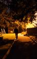
First let me say congratulations on your 2nd best finish so far! I remember this image well from the challenge and scored it a 7.
Lighting Challenge Relevance:
I think some voters mistook the artificial light source on the right (lamppost perhaps?) for the sun and counted some off for it (although if they had looked closer, they would have seen the night sky above the trees). You used a single light source quite effectively IMHO - I think it met the challenge quite well and was a strong entry.
Composition:
Here is where I think you probably took the biggest hit on your score. Several people commented on the centered position of the figure and I also notice the tilted horizon (while it can be used to emphasize artistically, I'm not sure it was effective here). I might consider straightening the horizon line and cropping more off the left - to offset your subject a bit more. I believe this would maintain the very strong mood you have so effectively established and alleviate some of the "centered composition" concerns.
Color/Focus:
I really like the warm tones you used - as I said above, you have established a very strong mood to this piece that really speaks to people (again as evidenced by people's comments). To me, it is very emotive and has an eerie loneliness feeling that is very appealing. The focus is a tad off (especially on the figure), but is not so much so that it is terribly distracting. I think you can get away with the man being OOF (showing movement), as long as the rest of the scene is sharp.
Overall:
I think that you got some positive feedback from commenters and that you submitted a strong entry into a tough challenge. Congratulations again on your 2nd best finish to date. I'm sure we will continue to see better and better things from you as you enter more challenges. Good work.
Just my 2 cents...