| Image |
Comment |
| 11/07/2005 06:33:08 PM |
|
| 11/07/2005 09:44:35 AM |
Topsby figmentComment by jillybean: this is a neat idea but if almost looks standing still ....maybe if the top was more colourful....see it a bit on the top one though. |
| 11/03/2005 08:40:25 PM |
Topsby figmentComment by ttreit: I personally don't like how there's no headroom on this shot...the top of the top is too close to the top of the picture...err...you get what I mean. :)
|
| 11/02/2005 09:32:34 AM |
Topsby figmentComment by JCYRHS: great reflection and motion blur. The composition is good too! and nice isolation. - 6 |
| 11/02/2005 05:48:35 AM |
Topsby figmentComment by temba: I'm not sure that this achieved what it intended to achieve - I certainly can't quite make it out. |
| 10/10/2005 02:43:10 PM |
|
| 10/10/2005 08:18:11 AM |
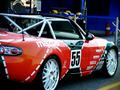
ZOOM! ZOOM!ZOOM!by figmentComment by HVGB_photos: Your car should have been more yellow than red to demonstrate complementary colour contrast against the colours in the background. |
| 10/08/2005 10:45:38 PM |
|
| 10/07/2005 09:36:19 PM |
ZOOM! ZOOM!ZOOM!by figmentComment by holyfam: maybe brighten the blue a little more so it can compete with the red, but of course red and blue don't really complement. Pic is very good otherwise |
| 10/07/2005 12:35:41 PM |
|
Home -
Challenges -
Community -
League -
Photos -
Cameras -
Lenses -
Learn -
Help -
Terms of Use -
Privacy -
Top ^
DPChallenge, and website content and design, Copyright © 2001-2026 Challenging Technologies, LLC.
All digital photo copyrights belong to the photographers and may not be used without permission.
Current Server Time: 05/31/2026 08:17:51 PM EDT.