| Image |
Comment |
| 05/06/2004 12:01:02 AM |
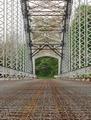
Widgetsby RefocusedComment by timmi: This is so much fun to look at. Nicely organized, great colourful abstract. |
 Photographer found comment helpful. Photographer found comment helpful. |
| 05/05/2004 11:50:59 PM |
|
| 05/05/2004 02:11:18 PM |
|
| Photographer found comment helpful. |
| 05/05/2004 01:21:47 PM |
|
| 05/05/2004 08:55:59 AM |
|
| Photographer found comment helpful. |
| 05/04/2004 11:39:06 AM |
|
| Photographer found comment helpful. |
| 05/04/2004 10:19:53 AM |
|
| Photographer found comment helpful. |
| 05/04/2004 04:32:09 AM |
Widgetsby RefocusedComment by redmoon: Now THIS is abstract as defined by the challenge, and no mistake (surprisingly few of these about). You know, i would rather preferred to have seen this for real, with the doo-dahs mounted on white card and displayed somewhere like the Tate or MOMA. I have no idea what those things are. Being largely clueless in this field, so i might be wrong, but i would have suggested that you took the shot with a smaller ISO and maybe with less exposure - it only just appears a tad noisy and from the pinks, a teeny bit over-exposed. But don't get me wrong, i love this to bits! Very deceptively simple, classy, effective, ABSTRACT, and a definite favourite. 9. |
| Photographer found comment helpful. |
| 05/03/2004 11:11:02 PM |
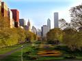
Chicago (My Second Home)by RefocusedComment by tyt2000: Great depth and beautiful range of colors. Thats a nice lookin park, definitely postcard worthy. The buildings look almost like cardboard peices.
Keep up the good work... |
| Photographer found comment helpful. |
| 05/03/2004 07:45:22 PM |
|
| Photographer found comment helpful. |
Home -
Challenges -
Community -
League -
Photos -
Cameras -
Lenses -
Learn -
Help -
Terms of Use -
Privacy -
Top ^
DPChallenge, and website content and design, Copyright © 2001-2026 Challenging Technologies, LLC.
All digital photo copyrights belong to the photographers and may not be used without permission.
Current Server Time: 07/29/2026 03:52:14 PM EDT.