| Image |
Comment |
| 10/26/2003 08:06:14 AM |
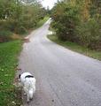
Lostby RefocusedComment by vadvirag: Very nice idea, but the road getting light in the backgrond leads my eyes away from the dog. |
 Photographer found comment helpful. Photographer found comment helpful. |
| 10/25/2003 05:40:04 PM |
|
| Photographer found comment helpful. |
| 10/25/2003 05:09:39 PM |
|
| Photographer found comment helpful. |
| 10/24/2003 07:56:15 PM |
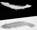
Lightby RefocusedComment by sonnyh: Good idea, good techniques and light as a feather and the light that is shining on it. Excellent. |
| Photographer found comment helpful. |
| 10/24/2003 04:21:05 PM |
|
| Photographer found comment helpful. |
| 10/24/2003 03:49:55 AM |
|
| Photographer found comment helpful. |
| 10/24/2003 03:20:12 AM |
|
| Photographer found comment helpful. |
| 10/23/2003 09:17:32 PM |
Lostby RefocusedComment by sketchtwin: looks like a random photo, if the dog was looking up and not moving i think it would work better |
| 10/23/2003 08:31:29 PM |
Lightby RefocusedComment by Simplicity: wonderful capture of light, and shadow. Nice texture and detail. Good clarity...10 |
| Photographer found comment helpful. |
| 10/23/2003 02:38:16 PM |
Lostby RefocusedComment by mhebert: For some reason I think it would have been more effective to have the dog futher down the road but then you'd just have to chase him/her. |
| Photographer found comment helpful. |
Home -
Challenges -
Community -
League -
Photos -
Cameras -
Lenses -
Learn -
Help -
Terms of Use -
Privacy -
Top ^
DPChallenge, and website content and design, Copyright © 2001-2026 Challenging Technologies, LLC.
All digital photo copyrights belong to the photographers and may not be used without permission.
Current Server Time: 07/25/2026 08:54:21 PM EDT.