| Image |
Comment |
| 06/18/2003 04:49:00 PM |
|
 Photographer found comment helpful. Photographer found comment helpful. |
| 06/18/2003 01:59:08 PM |
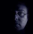
Half of Me is Blue...by pinbackComment by miller: I think the crop could be better here. I guess you were going for the neg space thing, but based on your face in the frame, I don't think it works too well. Might want to crop out all the black on the right then crop so your nose is centered - more of a portrait orientation rather than a square. |
| Photographer found comment helpful. |
| 06/18/2003 04:47:08 AM |
|
| Photographer found comment helpful. |
| 06/14/2003 07:46:36 AM |
Exclamation pointby pinbackComment by Annida: Hehe, lovely detail on the point of that pencil.. superb lighting. great shadow! I would have liked a little bit more of the actual pencil showing. I feel that the horizon is too centered at the moment. |
| Photographer found comment helpful. |
| 06/12/2003 09:31:53 PM |
|
| Photographer found comment helpful. |
| 06/12/2003 01:44:40 PM |
|
| Photographer found comment helpful. |
| 06/09/2003 11:49:26 PM |
|
| Photographer found comment helpful. |
| 06/09/2003 05:14:11 PM |
Exclamation pointby pinbackComment by Swashbuckler: Very precise photo, except the right edge of the pencil (??). Nice use of 1/3 rule. Nice reflection. All that said, it's not got a lot of WOW factor. 6 Rob the Swash |
| Photographer found comment helpful. |
| 05/28/2003 08:43:44 AM |
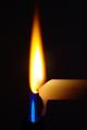
Two Flamesby pinbackComment by Gordon: CC: The two flames make a good complementary colour choice. The harder part is then making it in to an interesting subject. The main problem is getting the lighting interesting on the subject matter and I don't know that you've really achieved that too well here. The overall feeling is drab and dark, particularly with the white/ yelllowish candle.
however, I'm not sure I can suggest an approach that would make these subjects more lively or interesting. Perhaps a more interesting candle choice could have helped or a lighter background. You might have lost some of the flame detail then but it could have lifted the overall impression of the shot. The yellow flame also seems quite overexposed - again difficult to get right with the selected subject matter. |
| Photographer found comment helpful. |
| 05/24/2003 11:44:16 PM |
Two Flamesby pinbackComment by dsidwell: Unique and good idea! I'm not sure that stacking the flames on top of the other was the most effective choice, though. |
| Photographer found comment helpful. |
Home -
Challenges -
Community -
League -
Photos -
Cameras -
Lenses -
Learn -
Help -
Terms of Use -
Privacy -
Top ^
DPChallenge, and website content and design, Copyright © 2001-2026 Challenging Technologies, LLC.
All digital photo copyrights belong to the photographers and may not be used without permission.
Current Server Time: 07/16/2026 06:52:41 AM EDT.