| Image |
Comment |
| 01/13/2003 04:14:55 AM |
New Years Eve Feastby DougPazComment by Natasha: Critique Club
Now that looks good! Even though I am a vegeatrian something about this makes me want to come to your house!
Composition is good and has all the key ingredients for a good feast. The food stands alone, but the extra festive decoration look cool and I love the way that it captures the light.
Technical
I like the selective DOF here, looks just right, detail is still shown in the background but the main point of interest, the foreground is emphasised. Lighting is absolutely perfect in this shot, a tiny bit of flare on the back plate but it doesn't effect the overall quality of the shot too much.
My opinion
Great shot! Hope that you had a great New Year! ( And more than just the one bottle of wine!) |
 Photographer found comment helpful. Photographer found comment helpful. |
| 01/13/2003 03:35:32 AM |
|
| 01/13/2003 02:02:17 AM |
|
| 01/13/2003 01:07:37 AM |
|
| Photographer found comment helpful. |
| 01/13/2003 01:04:21 AM |
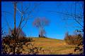
King of the Hillby DougPazComment by mcrael: Very nice composition - I like how the branches in front frame the tree on the hill. Colors are very bold. Good eye. |
| Photographer found comment helpful. |
| 01/13/2003 12:17:42 AM |
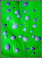
Purple Rainby DougPazComment by sulamk: Critique Club
Interesting idea, bright and colourful! I feel that the contrast could be boosted a bit as it is slightly washed out, possibly by the flash, which has reflected, slightly on the top!
Focus is good. |
| 01/12/2003 11:36:31 PM |
|
| 01/12/2003 11:09:15 PM |
|
| 01/12/2003 12:41:49 PM |
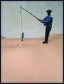
Wishful Thinkingby DougPazComment by stephan: Hi Douglas, your photo was assigned to me in context of the Critique Club. So here it goes:
Composition: I don't like the cluttered look. There are way too many objects in the background, which distract from your actual idea shown in the foreground.
Lighting: The lighting also does not support your idea. The colours in the background come out first. Also the lighting on the Bermuda catalogue is much brighter than the one of the foreground and thus attracting the eye more. I think a spot light on the red cross would make the scene more interesing.
Focus: Same here. The hand is not in focus but as a viewer I somehow expect it in focus because obiously that's where the "action" takes place.
Digital processing: The border is nice.
Art: Honestly said, I personally don't like the photo. It's a nice idea and also meets the challenge, but it's not more than a quick laugh and then you forget about it. Sorry.
|
| 01/11/2003 12:05:24 PM |
|
Home -
Challenges -
Community -
League -
Photos -
Cameras -
Lenses -
Learn -
Help -
Terms of Use -
Privacy -
Top ^
DPChallenge, and website content and design, Copyright © 2001-2026 Challenging Technologies, LLC.
All digital photo copyrights belong to the photographers and may not be used without permission.
Current Server Time: 06/12/2026 04:36:05 AM EDT.