| Image |
Comment |
| 08/17/2005 10:53:54 AM |
1955by dragonladyComment by dragonlady: Thanks everyone for your comments..I did try this in duotone and in b&w; however, I liked it in color...felt like I could step into the frame and be in 1955 by keeping the colors fresh..in duotone, it looks like a bygone era, not what I wanted in this case. Thanks for the 10 tens..wow! Who gave me that 1? lol. thank you for the inspiration I have found here at DPC. |
| 08/17/2005 07:19:51 AM |
1955by dragonladyComment by banmorn: Our concept of time is, perhaps, colored by the fading of memory. Absolutely nothing wrong with this with its bright, gorgeous colors...if you are depicting 1955 everything would have bright, shiny and new and saturated with color of being new, not faded and old. People just seem too relate lack of color with the past....but this was a time capsule challenge for which this is perfect and not a nostagia challenge for which mono/duo tones might have been better. Great finish. Congrats on your top 20! Message edited by author 2005-08-17 13:00:45. |
 Photographer found comment helpful. Photographer found comment helpful. |
| 08/17/2005 12:14:53 AM |
|
| Photographer found comment helpful. |
| 08/17/2005 12:04:45 AM |
|
| Photographer found comment helpful. |
| 08/15/2005 06:31:05 AM |
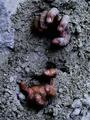
cementedby dragonladyComment by dragonlady: Thank you for comments and votes, even the 1, haha...this was my second picture with a greater than 6 average, and I am happy about it..sorry if this image disturbed a lot of people, but I had just seen a movie about Jimmy Hoffa and began thinking about him possibly being buried in cement somewhere and what being trapped in cement might look like... |
| 08/14/2005 11:38:11 PM |
|
| Photographer found comment helpful. |
| 08/14/2005 10:29:50 PM |
1955by dragonladyComment by Jutilda: Good job. Love the vivid colors. There is nothing about this that doesn't suite the time capsule of the era. You captured it perfectly. 10 |
| Photographer found comment helpful. |
| 08/14/2005 12:04:02 PM |
|
| Photographer found comment helpful. |
| 08/13/2005 08:54:35 PM |
cementedby dragonladyComment by HBunch: The solid looking upper left hand corner doesn't seem to fit with the rest of the photo to me. Definately has the illusion of someone being trapped under some cement. Focus and clarity seem ok. The hands look unnaturally reddish. Lighting looks good. Not sure about the angle. There really isn't anything wrong with it, but I wonder if a different angle would add more visual appeal. ~Heather~ |
| Photographer found comment helpful. |
| 08/13/2005 08:42:27 PM |
1955by dragonladyComment by roadrunner: great shot.. i love the little old petrol stations.... i also like the fact you kept it colour.... congrats..9 |
| Photographer found comment helpful. |
Home -
Challenges -
Community -
League -
Photos -
Cameras -
Lenses -
Learn -
Help -
Terms of Use -
Privacy -
Top ^
DPChallenge, and website content and design, Copyright © 2001-2026 Challenging Technologies, LLC.
All digital photo copyrights belong to the photographers and may not be used without permission.
Current Server Time: 06/22/2026 01:05:25 AM EDT.